

9 February 2015
Deep in thought on Saturday night I started thinking about an idea: small multiple radial barcharts on a clock face. Yes, just your average Saturday night thought then....Anyway below follows a Viz that was the culmination of that thought. Firstly, I found some data that I thought might suit the visualisation - the solar output to the National Grid in the UK. Then I set out to produce a radial bar chart in Tableau - I had an idea how I might go about this but a quick Google made me realise someone had beat me to it - here are the instructions.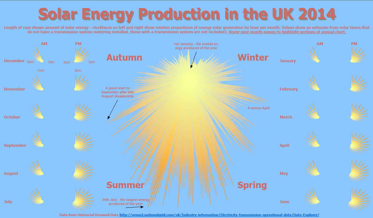
Here comes the Sun
I was pleased with the 'sun' effect - the result of the radial bar chart with a colour gradient. To fill the middle of the 'sun' I used a dual axis circle centred on the middle of the radial bar chart.Colour Themes
I needed a decent blue sky background for my Viz and a pleasing colour theme to go with it, so I headed over to Adobe Colour CC - this is a great resource (one my colleague Tim pointed me to) and it can be used to create or 'steal' useful colour themes that work well on a visualisation.Annotations
I hope the annotations lend some explanation to the chart and provide an overall story arc - I was concerned the chart may be initially confusing and so adding these hopefully lends some subtle explanation.Actions
I've used hover actions to highlight the monthly sections of the annual chart from the month names. The ordering of the month names follows the seasons, which is hopefully clear. The interactions on hover makes this clearer still, though it's a shame I can't break out AM/PM on the centre chart on hover easily.Best Practice?
This is a tough call, certainly there are easier ways to understand the annual solar production of the UK, a simple line chart say. However this fun and engaging Viz isn't too hard to interpret and so I hope I'll be forgiven. Ultimately I would enjoy some feedback and critique to understand the viewers thoughts in this aspect - and any others.And so the Viz
Click on the screenshot below to move to the new Tableau Public and enjoy this Viz. make sure you check out the new Tableau Public toolbar and other features along the way.Postscript
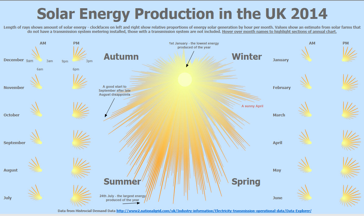
Publishing this Viz wasn't the end of the story - Zen Master Mark Jackson got in touch with me and offered some constructive feedback on my colour choices - on balance I think I agree they were a little on the heavy side - so I tweaked them a little, let me know what you think: