30 March 2018
Hey, everyone!
One of the most talked about features of Tableau 10.5 is Viz inTooltips - the ability to embed charts into the tooltips of other sheets. As the last few bugs of the update are dealt with and removed, businesses are going to increasingly start updating their Desktop and Server instances of the software to this version. As such, the team and I thought it would be a great time to brainstorm on some uses cases for the new feature. We've listed them below, and include a short explanation of the extra analytical power they add to the existing sheets and dashboards we're all used to building. Please note that this list is not meant to be exhaustive, but instead highlights additional ways of using Viz in Tooltips that are not yet common in the community.We'll let you explore the list, and feel free to add any of your own suggestions in the comments below!Highlighting Trends
This one is very straightforward: viz in tooltips are a fantastic way to provide information regarding the evolution of a particular measure over time. One of the obvious issues of putting a chart in a tooltip is that a user cannot interact with it as much to check what particular values are, but with sparklines, this not really an issue as one is mainly looking for the overall trend.In the example below, you can see the power of adding a line chart over a bar chart. It allows us to add context to our list of Top Customers, and by adding a trend line with the click of a button, we've also included a robust statistical measure of this customer's profit trend over time with almost no effort.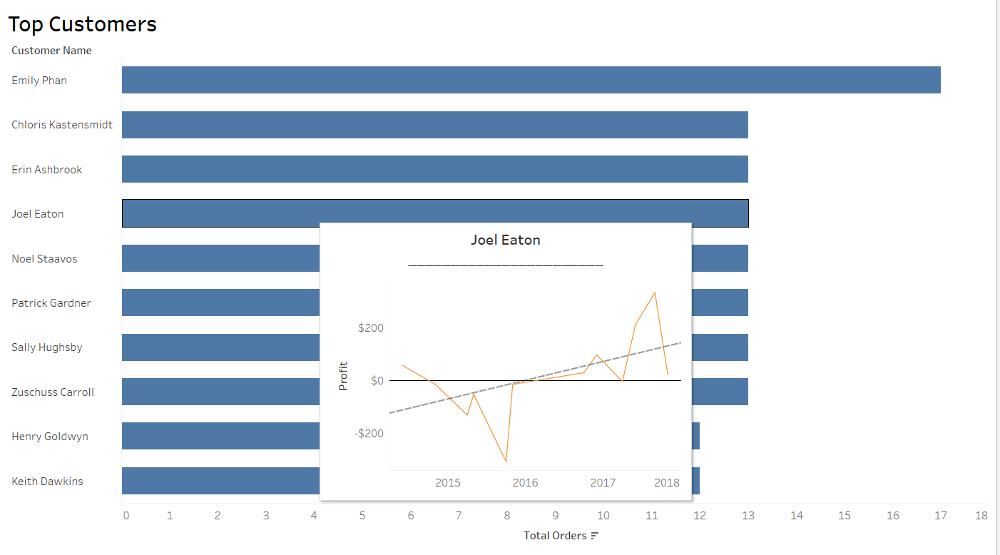
Describing the distribution of data
Often times, presenting data out of context can be both dangerous and useless: What insights can we really get about the profitability of a certain product if we don't compare it to the other things we have for sale?Viz in tooltips make describing our data much simpler and allows us to contextualize the main information we are presenting without cluttering a dashboard. In particular, if we are presenting a lot of information - such as a massive list of products as shown below - adding a histogram into our tooltip can help understand our products relative importance at a glance. Alternatively, a boxplot would also be a great chart to use in this case.In this example, a user who hovers over this product's total yearly profit can immediately see that it's performing particularly well, as only a few other products bring in $400 profit or more.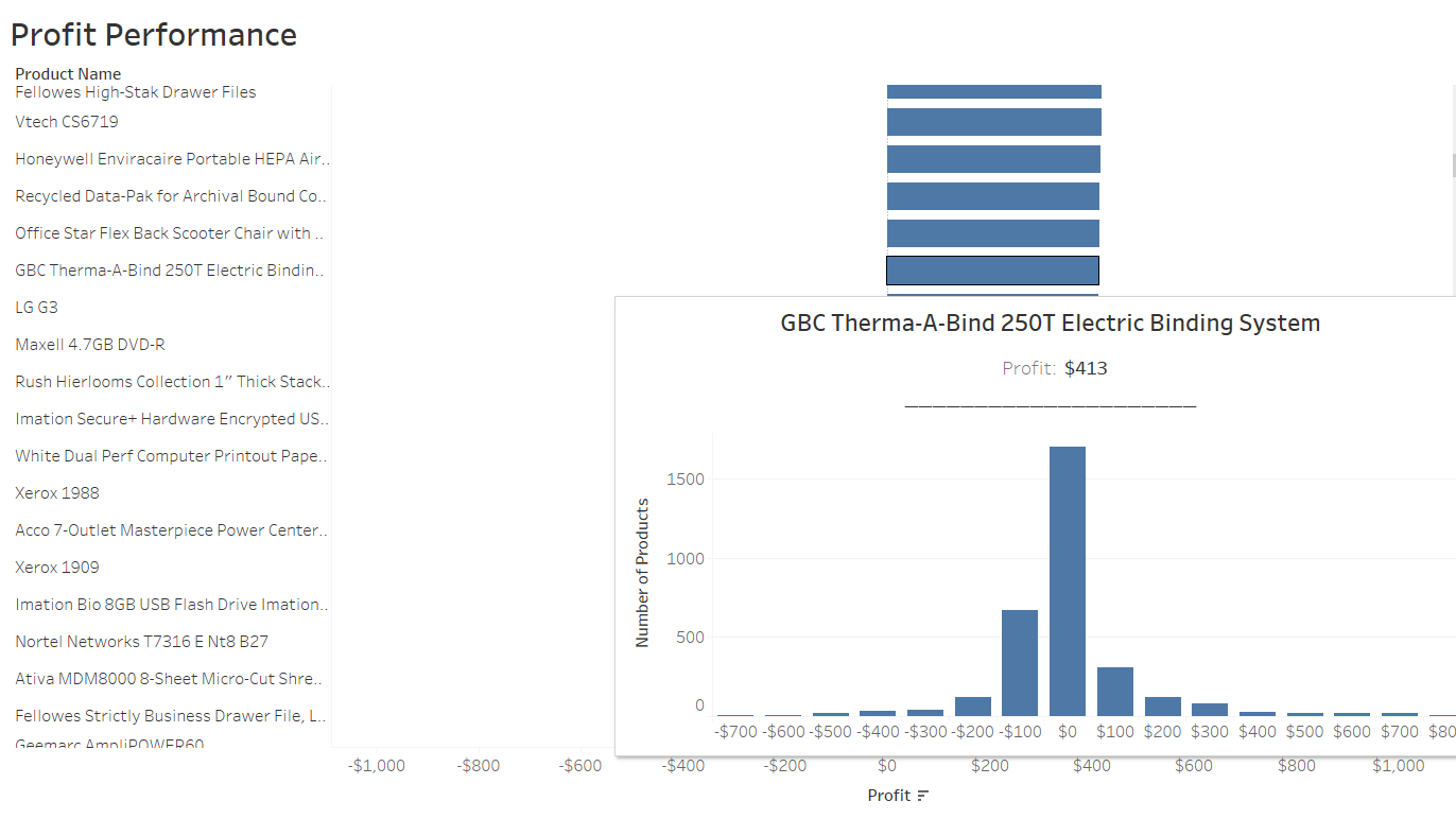
Layering different levels of time or geography
Often times, it can be complicated to provide different levels of granularity when looking at maps or data over time. For example, if you want to provide an overview of the spatial distribution of sales within a country, it can be difficult to then explore the performance of cities within the states themselves. Viz in tooltips makes this task simpler, as you can now allow users to explore data at a smaller geographic unit within a larger one.However, do note that as the user cannot interact with the map embedded in the tooltip, you will have to provide him with another means of identifying which cities or stores he is looking at. Check out the example below, where a bar char colored by the same measure is used to make it easier to identify what the cities on the in-depth map are. It makes it easy to see that Springfield - Orgeon's weakest performing city - is located near a profitable city, and so might suggest it's unprofitability are linked to idiosyncrasies and not a specific issue in that region of Oregon.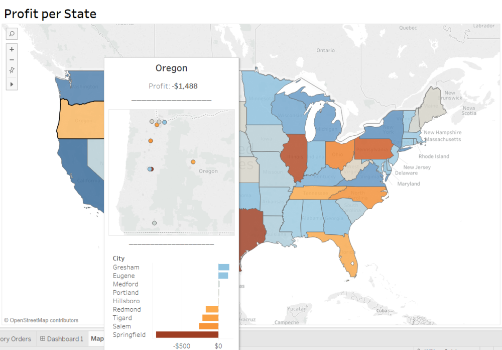 The same idea can be applied to time dimensions. Viz in tooltips can allow you to build in different levels of time, allowing a user to identify a period of interest over a larger time scale, and then immediately try and understand exactly what happened during that period by hovering over it. The view below would be particularly useful to a store manager trying to determine the impact of particular initiatives or discount period on his sales over a very large period of time.
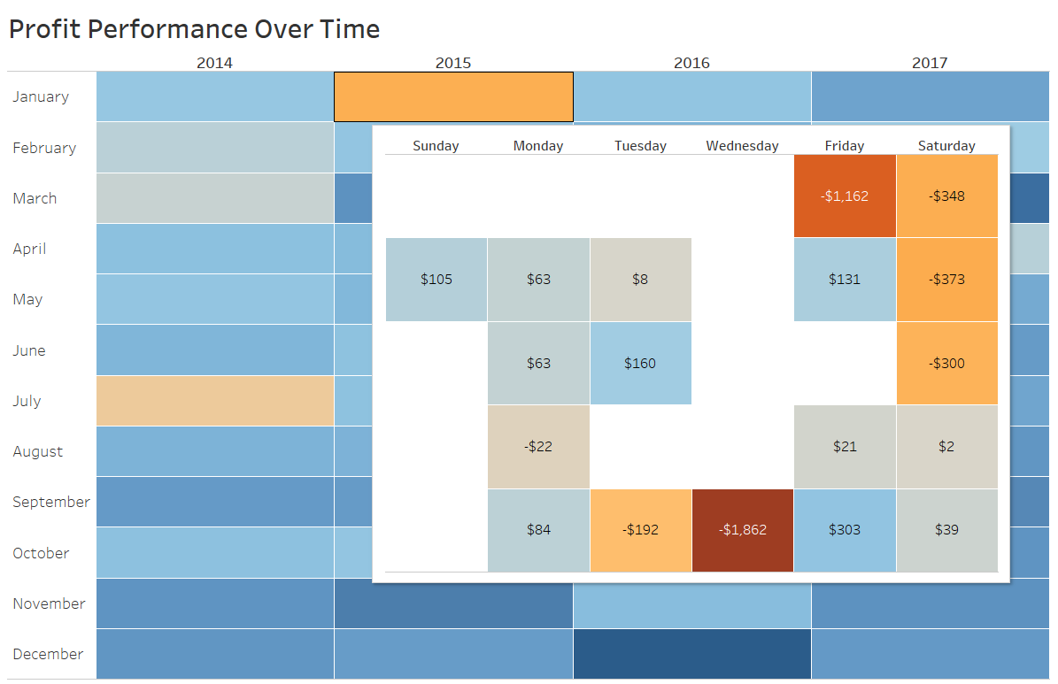
Dealing with string aggregations - get rid of that *
This is one of my personal favorites and, in my opinion, one of the best use case for viz in tooltips as it deals with a real issue Tableau had no solutions for in the past: returning multiple string values from a dimension in a tooltip.Let's say you wanted to create a dashboard to track the performance of your top customers. You build a bar chart, filter to include only the Top 10 profit-makers and drop it in. However, your different sales representatives ask you to add information regarding the number of orders they've placed in each of the categories of items you sell. You add that information to the tooltip, and this happens: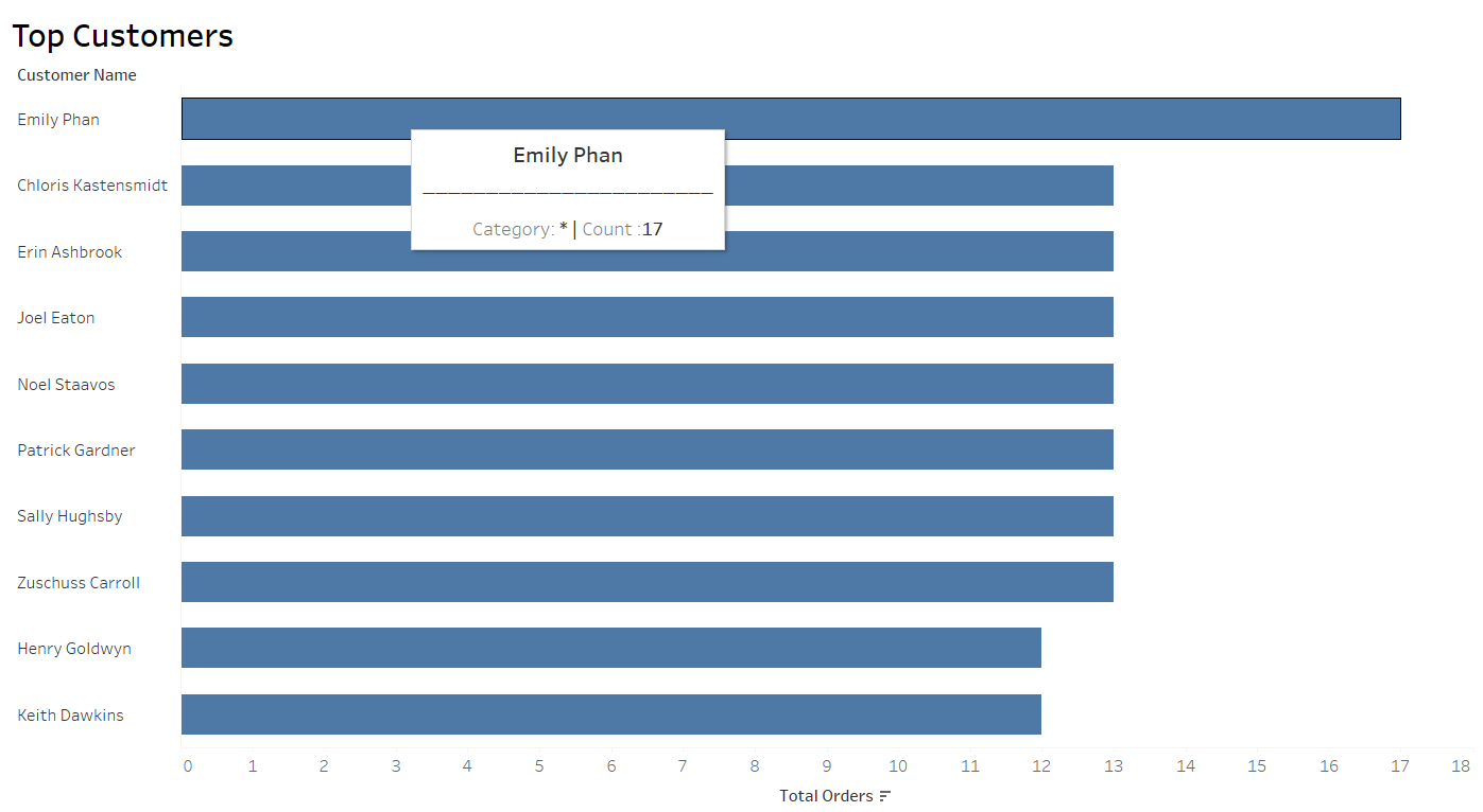 The infamous *. The reason this is happening is that Tableau can't aggregate strings. Unlike the count of orders - a measure - where Tableau looks at every row of data relating to Emily Phan and adds them up, the software can't aggregate the types of items as they are strings. You can't add up 'Technology' and 'Office Supplies'. Hence, because it can't aggregate them, there would be multiple values to return, and so Tableau returns a * instead. Have no fear! Viz in tooltips are here. You can now build a simple crosstab instead showing the detailed information about the dimension of interest, and drop that into the tooltip.Take a look here. We now have the specific breakdown of the number of orders per category. The * is dead. Long live the *!
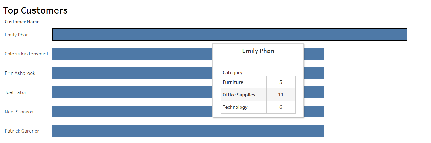
Making downloading your sheets' data easier for users
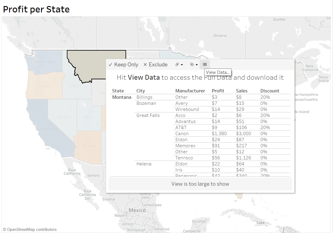
Now, I know this one shouldn't be in here: the whole point of Tableau is to try and get users to stop working in Excel but interact with the dashboards and charts instead. However, anybody who works with this software day to day knows that stakeholders often download the data behind the visualizations to take a look at it in a software they are more comfortable in. The issue is that it is often difficult for them to see what the data powering the chart they are interested in actually is. Viz in tooltips is a great way to make that as easy as possible.In the chart below, Montana's Regional manager can now easily obtain the data relating only to his state and view what he will be downloading by simply hovering over the tooltip.