


I've had the privilege of watching Tableau evolve over more than a decade, from a private company with a primarily US-based team through to going public and eventually being acquired by Salesforce. Throughout this journey, I've observed two fundamentally different approaches to how the Tableau team have developed the product, each with distinct philosophies about when and how features should reach end users.
The transition between these approaches has been fascinating to witness, particularly as long-time Tableau users grapple with a dramatically different development culture. What emerged are two contrasting philosophies: the pre-acquisition Tableau approach of deep research and refinement before release, and the post-acquisition Salesforce approach of releasing early and iterating in production.
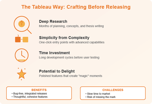
The Tableau Way: Crafting Before Releasing
In the classic Tableau development model, features began their journey with an idea. Perhaps it was a new chart type, a different method of interacting with visualisations, or even just reducing a four-click process down to one. But having an idea was never enough.
The critical question that drove every feature decision was simple yet profound: how does this help people see and understand their data? Every enhancement had to make data exploration either easier or more powerful than before. Could users see more of their data? Could they drill into it faster? Did it enable them to understand patterns they couldn't see previously?
Beyond utility, there was a philosophy of simplicity. Not basic, but simple to use. The team would take genuinely complex capabilities and refine them until the initial action was remarkably simple: one click, one drag and drop, one function to remember. But crucially, that simple entry point could then be built upon for more advanced use cases.
The table calculation feature exemplifies this perfectly. In theory, Tableau could have created a generic function allowing users to inject SQL queries for additional computation. It would have been powerful and flexible, but realistically only 5% of users would have understood it or used it. Instead, the team identified the most common table calculations following the 80/20 rule and made them available with a couple of clicks. Users could then modify and refine these calculations, and those with more advanced needs could create highly sophisticated custom versions.
This approach built complexity into the software while presenting simplicity to the user. It's how Tableau, despite being easy to use, became extraordinarily powerful for data analysis and created dashboards capable of doing virtually anything users wanted.
The Cost of Perfection
However, this thorough approach had a significant downside: time. Teams would spend months researching, writing design concepts, creating interface mockups and essentially writing entire theses on the impact of a feature before users ever saw it. Sometimes, despite all that preparation, the execution simply didn't hit the mark.
Story Points serve as a cautionary tale. On paper, the concept was fantastic: guide audiences through a narrative within the data, presenting with live, interactive dashboards rather than static slides. The thesis around lensing in and out of a data story was well developed. But in creating that thesis, the team overlooked something fundamental: presentations need to look good, flow engagingly and capture the audience's imagination.
The result was a somewhat dry and static way to present interactive data. Despite being showcased at Tableau Conference keynotes and positioned as a major feature, Story Points never achieved significant adoption. It became a legacy feature and technical dept seeing minimal development and usage. Years of careful thought and development culminated in something that simply didn't resonate.
This highlights the inherent tension in the approach. While it could create magical, delightful features that deeply integrated with the rest of the product, it came at the cost of time. Users would grow frustrated asking why a simple change they needed couldn't be implemented quickly, when surely it would only take a couple of weeks. The answer was that even small changes had to go through this comprehensive workflow designed for substantial features.
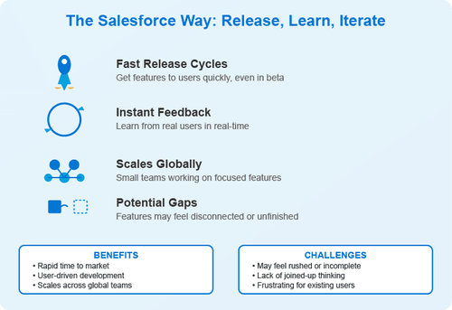
The Salesforce Way: Release, Learn, Iterate
Fast forward to the post-acquisition world. The Tableau that had been built on careful thesis-writing and thoughtful development had largely moved on. The development team now operated within the Salesforce ecosystem, bringing a completely different mentality: release features as early as possible, even if they might not feel fully ready.
The philosophy centres on getting changes into users' hands quickly. They want people trying features, using them and most importantly, providing feedback. This is amplified by Salesforce's broader ecosystem of partners and integrators who need early access to build their own solutions. Operating primarily in the cloud means there's no concept of alpha or beta installations; features are either in the product or they're not. The only distinction is whether something is flagged as beta, essentially warning users they might want to limit it to sandbox environments.
This approach dramatically shortens the time from announcement to user adoption. The benefits are significant: instant feedback on whether features solve real world problems, rapid identification of implementation issues and the ability to observe how users actually interact with the feature rather than how you expected them to. In theory, this builds better products by ensuring what you're creating is what users actually want and need.
The Cost of Speed
However, moving from a culture where features were almost completely bug-free on release, integrated perfectly with existing functionality and had the potential to delight in unexpected ways, to one where features can feel rushed and incomplete can be jarring.
When you're tasked in the Salesforce world with changing how a button works or modifying the layout of objects, the expectation is clear: get it done and get it into production quickly. This scales well with small, nimble teams working on narrow feature sets across global locations. But it doesn't always lead to joined-up thinking.
New features can feel disconnected and unfinished. The basic functionality might be there, but the advanced capabilities and the delightful touches that create a fully integrated experience often aren't.
The Collision: Tableau Next
The release of Tableau Next, particularly the Tableau Semantic Layer, crystallises this clash of cultures. Developed by a team within Salesforce, separate from the core Tableau product team, it's functionally sound but difficult to use and cumbersome. There are times the interface uses perhaps 20% of available screen space for no apparent reason. It feels and looks like a Salesforce product, yet it's branded as Tableau and positioned as central to Tableau Next.
Would Tableau Next have been released this quickly using the classic Tableau development approach? Absolutely not. Creating a thesis around how people would use analytics within Salesforce and across the broader Tableau product suite would have taken years. Tableau was practically starting from scratch, and some features in Tableau Next wouldn't have been possible under the old approach since the necessary technologies didn't exist when original Tableau was built.
For core Tableau users, trialing Tableau Next can be frustrating. For Salesforce CRM Analytics users, it likely feels like a nice step forward: an easier way to do analytics with their data, with a drag-and-drop interface for creating dashboards and metrics. From the Salesforce ecosystem perspective Tableau Next is brilliant. Every component within Next is a Salesforce object, making it straightforward for integrators to create solutions that span the entire platform including ready-made dashboards and semantic models.
But that new rapid, Salesforce-centric development method remains a sore spot for Tableau's core users.
Finding the Middle Ground
Salesforce has learned that the beautiful Tableau core product, with all its thoughtful development and thesis-driven features, is here to stay. They cannot replace it with a rapidly developed, heavily Salesforce-integrated alternative. Yet the development team of old has moved on.
The future of Tableau development remains very much up for discussion and debate. Somehow, these two approaches need to meet in the middle. The challenge for 2026 and beyond will be finding that balance: maintaining the speed and responsiveness of modern development practices while preserving the thoughtfulness, integration and magic that made Tableau special in the first place.
Both approaches have merit. The question isn't which is right, but rather how to combine the best of both worlds: the careful consideration and delightful simplicity of the Tableau way with the rapid iteration and user feedback of the Salesforce way. The organisations that solve this puzzle will be the ones that truly serve their users well.