

What is the Urban Health Index?
Launched in 2021, the UHI is a unique data-driven tool designed to measure social progress in the London boroughs of Lambeth and Southwark. It uses a range of social, health, and environmental indicators to paint a detailed picture of neighbourhood health. By combining these different data points, the UHI helps us understand how our local environment directly impacts residents' well-being. It allows users to compare different neighbourhoods and pinpoint specific areas of strength and challenge within each ward.
From Raw Data to Interactive Insights
Our brilliant consultant, Ellen Blackburn, was tasked with turning the complex Urban Health Index (UHI) data into something everyone could understand. She worked on visualising the 2021 and 2023 data, and for the latest 2025 version, she wanted to go even further. The goal was to transform a static scorecard into a dynamic, interactive experience.
And here is the result
https://urbanhealth.org.uk/insights/data/urban-health-index-uhi-for-lambeth-and-southwark
The Challenge
The project came with its own set of hurdles. The data wasn't in a single, easy-to-use format. We received multiple files: one for indicator values, another for category scores, and a third for definitions. This fragmented data structure made it difficult to jump straight into visualisation.
Once the data was prepped, building the visualisations in Tableau required a delicate balance. Ellen needed to give users the flexibility to explore any indicator they wanted, while also providing enough guidance to ensure the dashboards were intuitive and not overwhelming. The key was to make the information accessible without sacrificing depth.
The Solution
To tackle the data challenge, Ellen built a robust Alteryx workflow. This process was a game-changer, as it involved restructuring, joining, and cleaning all the data, consolidating everything into a single, polished dataset. This streamlined approach laid the perfect foundation for our visualisation work.
With the data ready, she created eight specialised dashboards in Tableau. Each dashboard was designed with usability in mind. Ellen spent time refining the user experience, adding clear instructions and context to support navigation. The result is a smooth, informative journey for anyone looking to explore the UHI data.
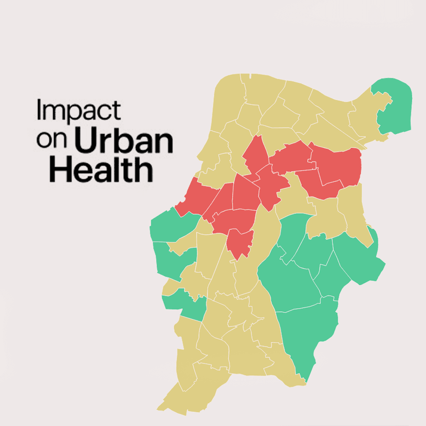
The Impact
By making this complex data accessible, we're helping to create a healthier London. The interactive UHI dashboards are available to the public.
You can explore the dashboards for yourself and see the work I did on the 2021, 2023, and 2025 versions of the Urban Health Index by visiting the official website.
https://urbanhealth.org.uk/insights/data/urban-health-index-uhi-for-lambeth-and-southwark
We hope this project will empower community leaders, policymakers, and residents to gain a deeper understanding of their neighbourhoods. This understanding is the first step toward building targeted interventions and fostering healthier, more equitable communities.