

25 November 2016
Random forest is one of the methods of supervised learning, a Machine Learning task where the prediction is done by constructing a set of if-then split rules that optimize criteria.Machine learning automates algorithms that interactively learn from data and it allows computers to find hidden insights without being explicitly programmed where to look.The iterative aspect of machine learning is important because as models are exposed to new data, they are able to independently adapt. They learn from previous computations to produce reliable, repeatable decisions and results.In supervised learning, we have a data set that already knows what the correct output should look like, having an idea that there is a relationship between the input and the output. The goal of this method is to predict a variable of interest.In my blog I want to explain which were the most important factors to survive at the Titanic disaster.All my generation can’t forget about Titanic interpretation of Di Caprio, shaking in the middle of the ice, but we also remember that if you had a ticket of first class and if you were a woman or a child, your chance was much higher to get inside one of the few lifeboats.I got my dataset from Kaggle, and I run my method in Alteryx.This is the description of my variables of interest (or predictors, I think/know that these factors had an impact on the probability to survive):Target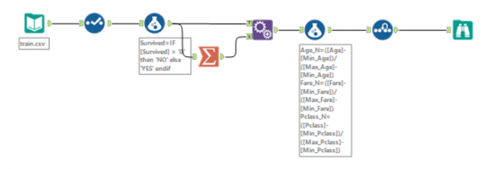 First step, I want to normalize my variables, this is because I have different kind of data with different ranges (fare goes from £4 to £512, class just contains 1, 2 and 3). This method is called ‘feature scaling’, you can find more documentation here.In order to re scale data, you need this formula:
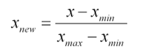 I used a summarize tool to get the min and max of fare, pclass and age (not sex as it’s just 0 or 1) and then I calculate three new measures in a range of 0 -1.Now a sample must be created with the sample tool as you want to train the predictive models on a subset of data (estimation sample) and validate the models on another subset (validation sample). Anything not categorized in these two gets to the Holdout sample.Just to remind what we are doing, in supervised learning we have a data set called training set with the YES/NO responses and the other variables. From this dataset I want to learn how to predict the YES/NO answers. In general, supervised learning needs:a training set(YES/NO RESPONSES and the independent variables) which we fit to our learning algorithm. As an output we get h(hypothesis) which is a function that takes the independent variables as an input, and tries to output the estimate value of y.h is a function that maps from x to y. We test different statistical models during the analysis. Find which is the best in predicting the probability of YES/NO.Logistic Regression tool, Boosted model and Forest model: class of machine learning methods that predict a target variable using one or more variables that are expected to have an influence on the target variable.How to test goodness of prediction?Lift chart tool: it’s a graphical tool that indicate the relative predictive power of different binary classification models.This tool produces two very commonly used charts of this type:
 Now I can add my test dataset (a new dataset with all predictors but without the target variable) and through the random forest algorithm I calculate the probability of YES/NO for each person/row.
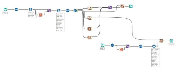
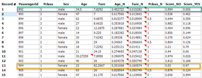 So we can see that for a male of 3rd class (green) the probability to die were of 99% whereas if you were woman of 1st class (yellow) your chances to die drop to 3% (and 97% to survive!).Let’s plot it in Tableau!If you ever have built a Sankey, you should be familiar with T and sigmoid (otherwise have a look at this nice blog from Chris Love about Sankey chart). In order to have T I need to create an excel table with a column called T that goes from -6 to 6 (with an increment of 0.25), then join it with your dataset (create a dummy column with the string ‘link’ and join the two tables).
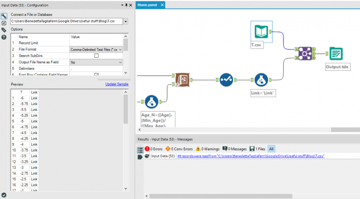 In Tableau, I create some calculation fields.First of all, you need to create levels with your predictors.Level 0 : ‘Start’Level 1 : [Sex]Level 2 : [PClass]Level 3 : [Age]Then you need to create positions again from 0 to 4 writing ‘INDEX()/WINDOW_MAX(INDEX()+1)’ and on default table calculation, inside the calc field, you need to edit ‘compute using’ –> ‘advanced’ and ‘addressing’ by level 0, level 1, level 2, level 3. Inside ‘At the level’ select the same number of the position (position 0 will have level 0, position 1 will have position 1 and so on).
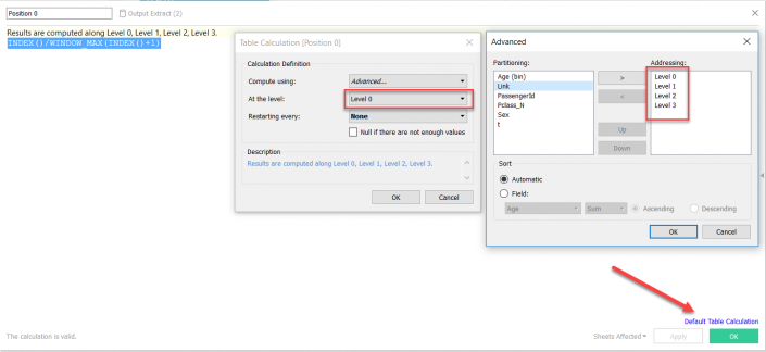 Some more calculations:Sigmoid: 1/(1+EXP(1)^-[T])Curve A : [Position 0]+([Position 1]-[Position 0])*ATTR([Sigmoid])Curve B : [Position 1]+([Position 2]-[Position 1])*ATTR([Sigmoid])Curve C : [Position 2]+([Position 3]-[Position 2])*ATTR([Sigmoid])Now we are finally ready to build our view:Drag all levels (from 0 to 4) on details, T on column (change it to continuous) and Curve A, Curve B and Curve C in rows (you will have then measure values).Curve A, B and C are table calculations therefore click edit table calculation, select specific dimensions (all levels, not T) and change ‘at the level’ like the following: curve A will be level 0, curve B will be level 1 and curve C will be level 2).Now drag measure names on columns and here you have your random forest!
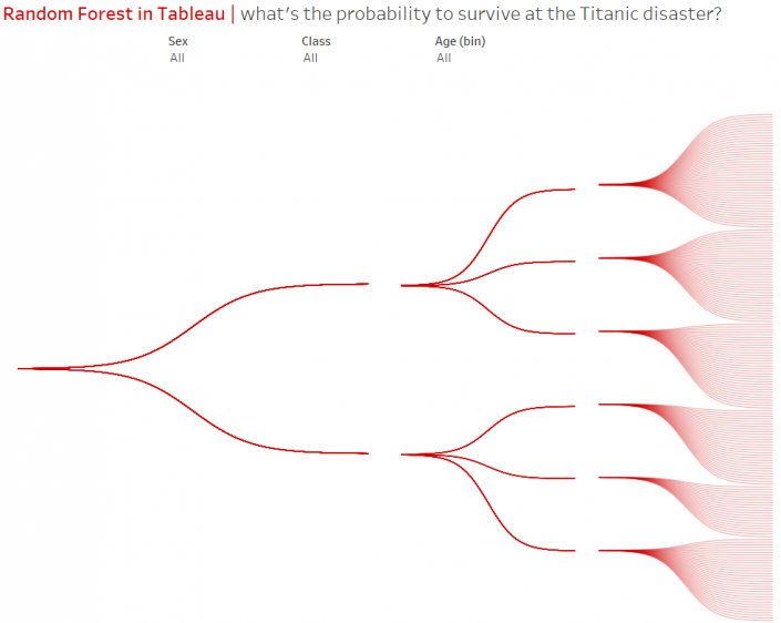 You can download the Alteryx workflow here.Have a look at the Tableau workbook here.Thanks!
- Survival Survival (Yes, No)
- pClass Passenger Class (1=1st, 2=2nd, 3=3rd)
- Sex Sex (Male, female)
- Age Age (0-99)
- Fare Passenger fare (£)
First step, I want to normalize my variables, this is because I have different kind of data with different ranges (fare goes from £4 to £512, class just contains 1, 2 and 3). This method is called ‘feature scaling’, you can find more documentation here.In order to re scale data, you need this formula:I used a summarize tool to get the min and max of fare, pclass and age (not sex as it’s just 0 or 1) and then I calculate three new measures in a range of 0 -1.Now a sample must be created with the sample tool as you want to train the predictive models on a subset of data (estimation sample) and validate the models on another subset (validation sample). Anything not categorized in these two gets to the Holdout sample.Just to remind what we are doing, in supervised learning we have a data set called training set with the YES/NO responses and the other variables. From this dataset I want to learn how to predict the YES/NO answers. In general, supervised learning needs:a training set(YES/NO RESPONSES and the independent variables) which we fit to our learning algorithm. As an output we get h(hypothesis) which is a function that takes the independent variables as an input, and tries to output the estimate value of y.h is a function that maps from x to y. We test different statistical models during the analysis. Find which is the best in predicting the probability of YES/NO.Logistic Regression tool, Boosted model and Forest model: class of machine learning methods that predict a target variable using one or more variables that are expected to have an influence on the target variable.How to test goodness of prediction?Lift chart tool: it’s a graphical tool that indicate the relative predictive power of different binary classification models.This tool produces two very commonly used charts of this type:- the cumulative captured response chart (also called a gains chart)
- incremental response rate chart
Now I can add my test dataset (a new dataset with all predictors but without the target variable) and through the random forest algorithm I calculate the probability of YES/NO for each person/row.So we can see that for a male of 3rd class (green) the probability to die were of 99% whereas if you were woman of 1st class (yellow) your chances to die drop to 3% (and 97% to survive!).Let’s plot it in Tableau!If you ever have built a Sankey, you should be familiar with T and sigmoid (otherwise have a look at this nice blog from Chris Love about Sankey chart). In order to have T I need to create an excel table with a column called T that goes from -6 to 6 (with an increment of 0.25), then join it with your dataset (create a dummy column with the string ‘link’ and join the two tables).In Tableau, I create some calculation fields.First of all, you need to create levels with your predictors.Level 0 : ‘Start’Level 1 : [Sex]Level 2 : [PClass]Level 3 : [Age]Then you need to create positions again from 0 to 4 writing ‘INDEX()/WINDOW_MAX(INDEX()+1)’ and on default table calculation, inside the calc field, you need to edit ‘compute using’ –> ‘advanced’ and ‘addressing’ by level 0, level 1, level 2, level 3. Inside ‘At the level’ select the same number of the position (position 0 will have level 0, position 1 will have position 1 and so on).Some more calculations:Sigmoid: 1/(1+EXP(1)^-[T])Curve A : [Position 0]+([Position 1]-[Position 0])*ATTR([Sigmoid])Curve B : [Position 1]+([Position 2]-[Position 1])*ATTR([Sigmoid])Curve C : [Position 2]+([Position 3]-[Position 2])*ATTR([Sigmoid])Now we are finally ready to build our view:Drag all levels (from 0 to 4) on details, T on column (change it to continuous) and Curve A, Curve B and Curve C in rows (you will have then measure values).Curve A, B and C are table calculations therefore click edit table calculation, select specific dimensions (all levels, not T) and change ‘at the level’ like the following: curve A will be level 0, curve B will be level 1 and curve C will be level 2).Now drag measure names on columns and here you have your random forest!You can download the Alteryx workflow here.Have a look at the Tableau workbook here.Thanks!