

21 October 2013
Just over a month ago now I had the privilege of speaking at the Fanalytics session at the Tableau Customer Conference 2013 in Washington DC. My talk, based on my own learning experience of Tableau and Tableau Public, centered around a key rule I found when developing dashboards...'Only answer one question per dashboard'. If your topic is complicated or the data is deep and interesting then make it multiple dashboards and walk the user through them. But as an end user coming in fresh to this particular representation of data it's difficult enough trying to understand the answer from multiple charts let alone remember which chart is answering which question.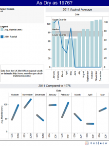 This simple rule, which I still hold myself to, came about by throwing myself into the deep end of data visualisation in the public space...my first publication on Tableau Public and The Guardian Datastore. Looking back at that first piece I was so excited to get out there, I can see I started off well. My reason for the work was to answer the question 'Was the UK in 2011 as dry as in 1976?' and as you can see that statement of intent is proudly displayed at the top. Great start!Then things started to go wrong. You see over the past 2 years, since Tableau got the full focus of my professional career, I've come to the conclusion that there are two types of dashboards. The first is the one question dashboard and the second is the explorer dashboard. Choosing the right one can mean the difference enlightenment and confusion.Unlike answering one question, which assumes the potential end user has a limited understanding of the subject matter and/or underlying data, the explorer dashboard is a tool for experts of both the subject and the data. An explorer dashboard doesn't set out to answer one particular question but instead frees a large or complicated dataset into something easily queried in many different ways via a data driven visual tool such as Tableau. But it will only be meaningful to a user who already knows enough about the subject area to develop their own questions.
Golden Rule
This simple rule, which I still hold myself to, came about by throwing myself into the deep end of data visualisation in the public space...my first publication on Tableau Public and The Guardian Datastore. Looking back at that first piece I was so excited to get out there, I can see I started off well. My reason for the work was to answer the question 'Was the UK in 2011 as dry as in 1976?' and as you can see that statement of intent is proudly displayed at the top. Great start!Then things started to go wrong. You see over the past 2 years, since Tableau got the full focus of my professional career, I've come to the conclusion that there are two types of dashboards. The first is the one question dashboard and the second is the explorer dashboard. Choosing the right one can mean the difference enlightenment and confusion.Unlike answering one question, which assumes the potential end user has a limited understanding of the subject matter and/or underlying data, the explorer dashboard is a tool for experts of both the subject and the data. An explorer dashboard doesn't set out to answer one particular question but instead frees a large or complicated dataset into something easily queried in many different ways via a data driven visual tool such as Tableau. But it will only be meaningful to a user who already knows enough about the subject area to develop their own questions.