20 November 2014
 Show Me How: Text Tables
Whatever you’re doing in Tableau then I think it’s fair to say that you’re likely to be using Text Tables (also known as crosstabs) somewhere in your reports, though never more so than for users first dipping their toes into Tableau. Love them or hate them they are here to stay.Excel Pivot Tables or crosstabs are probably people’s first introduction to text tables and as such they have become the mainstay of the BI world as a way of quickly conveying important numbers at a glance, however they are often overused. Before you start with a text table make sure you ask yourself these important questions:1. Is the end user initially looking for the actual numbers, or at an overall trend?2. Do they need to know all the figures or are they looking for outliers?3. Are the figures needed at this level of detail or is the user likely to need to drill down into the data?4. Is the report likely to be printed? Or will it be used interactively?If the answer to each of these questions is the former option then it’s likely that yes, a text table is an appropriate choice for showing your data, otherwise you might want to consider more visual chart types of showing your data to allow the user to determine trends, outliers and summaries and then interactively work with your report to find the detail themselves.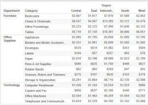 But you knew all that right? Otherwise you would be using the best visual analytics tool on the market?
Show Me
The Show Me button for Text Tables in Tableau will always do a good job of trying to produce a text table from the elements (dimensions and measures) you are using in the view, but sometimes it may not do what you expect. How does Tableau decide where to drop the various elements to produce your Text Table.Firstly let’s talk about Date Dimensions, Tableau will drop these onto the Columns pane. This is sensible, Tableau expects you will want to look across years / months and compare the values, having these going across the view makes sense.What about Related Dimensions, Tableau will drop these onto the view along rows, in a hierarchy if it detects there is a relationship between the two elements in the view. Try this: using the Superstore Sales dataset provided with Tableau, drop Department onto Columns and Category onto Rows. Drop any old measure into the centre of the view. Now click the Show Me Text Table button, see what Tableau did? Clever huh: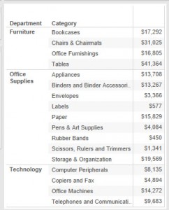 There’s a relationship between Category and Department in the data, we haven’t told Tableau about it but Tableau looked at the intersections between the two dimensions in the dataset and knew it shouldn’t be presented as a crosstab but as a set of row level data. Try the same thing with two unrelated dimensions, notice the difference? Yes Tableau does lots of work you didn’t realise.If you did as I suggested and dropped two unrelated dimensions on the view you will have seen a crosstab report, this is what Tableau will produce by default with Show Me using unrelated dimensions.
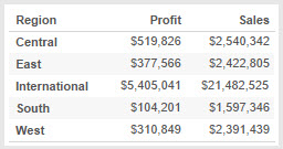
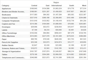 More than one measure? Show Me will automatically use the Measure Names, Measure Values pills to display those in the table – it will use the columns to do this, again this is typically we’re you’d expect to see these values right?