14 April 2015
In this post in the Show Me How Series we're going to talk about Dual Lines. Why use them, how to create them without Show Me, and why they might not always be appropriate as visual best practice.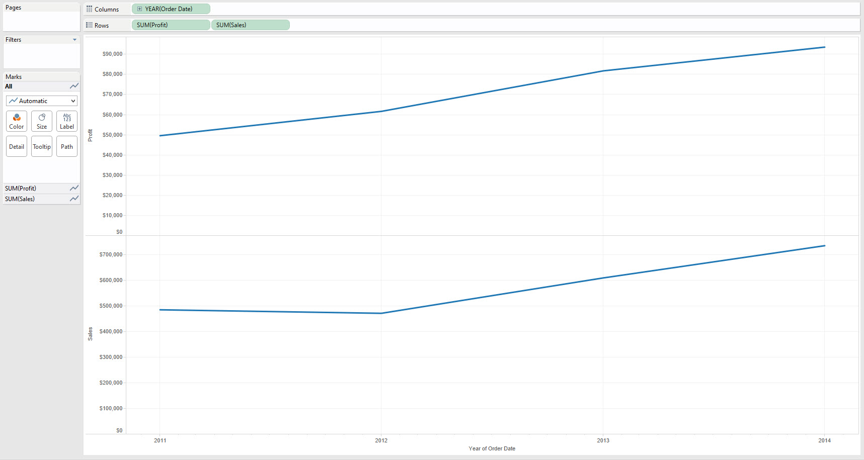 Show Me - Continuous Lines[/caption][caption id='attachment_5678' align='aligncenter' width='600']
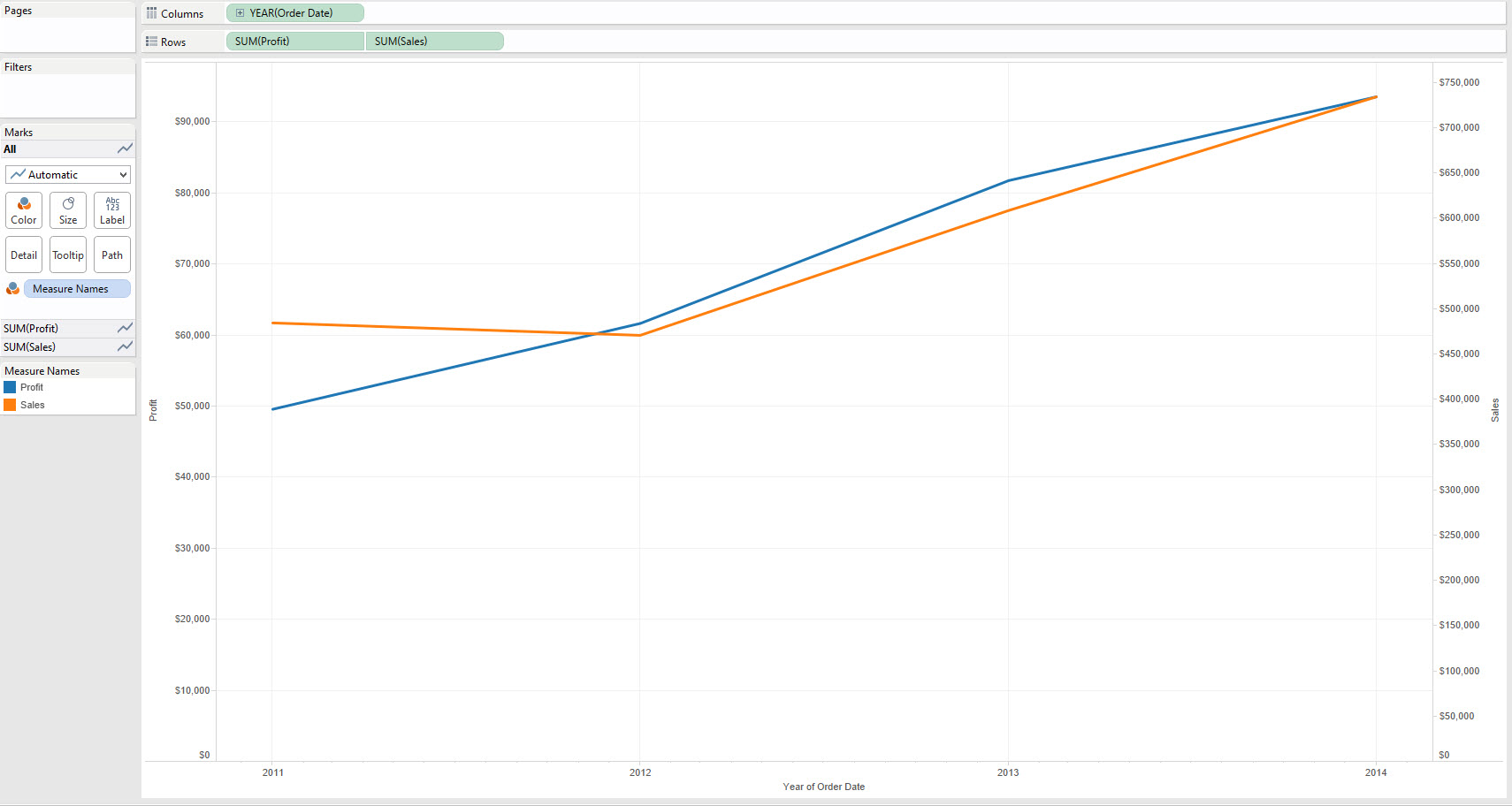 Show Me - Dual Lines[/caption]The difference should be clear from a visual stand-point is clear. The Dual lines has created a second axis to display the data, while Continuous Lines simply added a second pane with another axis below the first. Let's just clarify that terminology:Axis - This is created whenever we use a green pill in TableauPane - This is an area of our worksheet created by using two different measures or two dimensions on the same row or column. e.g. there are two panes on Rows in the first image above.Dual Axis - Two axes on the same pane, in Tableau the axes appear either side of pane, e.g. in the second image above Profit is on the left Axes and Sales on the Right.
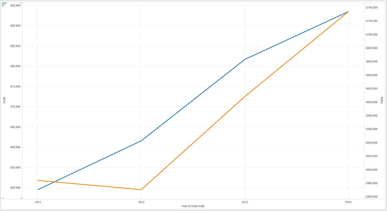 Sales (orange) dipped slightly in 2012 but have mainly kept steady in line with Profit (blue)[/caption][caption id='attachment_5682' align='aligncenter' width='600']
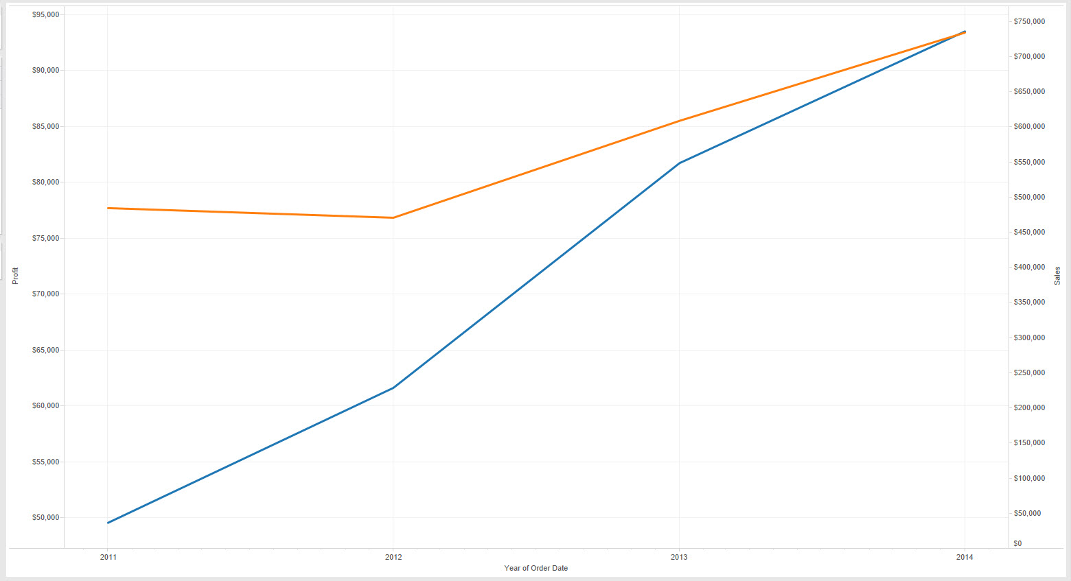 Sales (orange) have remained relatively steady but Profit (blue) is rising much more over the same period[/caption][caption id='attachment_5681' align='aligncenter' width='600']
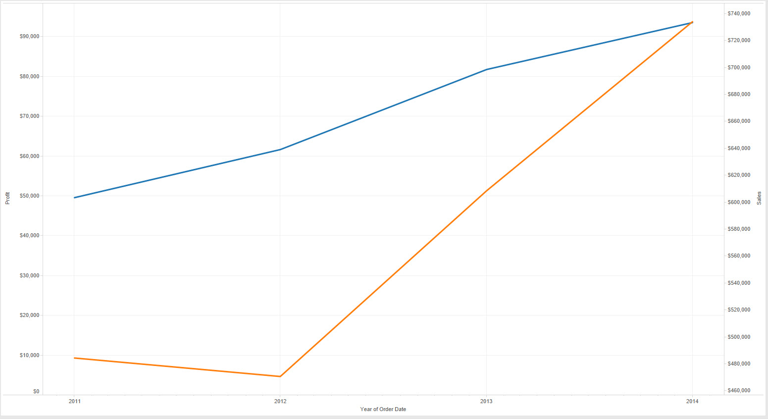 Sales (orange) have seen a dramatic increase after the small dip in 2012 but Profit (blue) has seen a much steadier increase[/caption]The problem with the above three charts is that they all are working off the same data but with different scales. okay so I cheated and removed the zero of some of the axes to change the scale but the point remains that the relative values in dual axes charts are arbitrary. The examples above illustrate how a user could easily misrepresent the relationship between sales and profit in each case.Stephen Few goes as far to say:
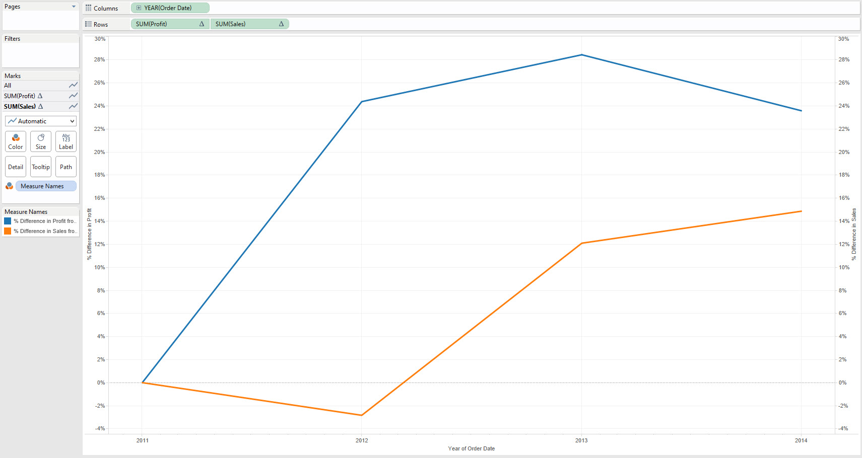
Show Me Dual Lines
Using Show Me to create Dual Line charts is straight forward, however first we need to remember the lessons from our post on Continuous Lines - Dual Lines are merely an extension of those. The key difference - we need at least two measures obviously.Let's look at the difference in the results, I'm using Superstore Sales and Order Date - looking at both Sales and Profit. The first image below shows what happens with using Continuous Lines in Show Me, the latter using Dual Lines.[caption id='attachment_5679' align='aligncenter' width='600'] Show Me - Continuous Lines[/caption][caption id='attachment_5678' align='aligncenter' width='600'] Show Me - Dual Lines[/caption]The difference should be clear from a visual stand-point is clear. The Dual lines has created a second axis to display the data, while Continuous Lines simply added a second pane with another axis below the first. Let's just clarify that terminology:Axis - This is created whenever we use a green pill in TableauPane - This is an area of our worksheet created by using two different measures or two dimensions on the same row or column. e.g. there are two panes on Rows in the first image above.Dual Axis - Two axes on the same pane, in Tableau the axes appear either side of pane, e.g. in the second image above Profit is on the left Axes and Sales on the Right.Visual Best Practice Considerations
Look again at the example above of the Dual Lines, how easy is it to read? What are the Sales in 2013?Chances are your eyes had to do several things to look at that question:1. They went to the lines, that's natural. Then you realised you needed more information..
2. The Legend told you which colour was which...(you need Orange)
3. The Axes labels told you the scale of the lines...(the right hand axes)
4. Finally you used both pieces of information to find the answer (about $600,000)
Wow, that's a lot of work right? Not something you want people viewing your data to have to do a lot of.Secondly consider the following three visuals and associated interpretation from a user:[caption id='attachment_5683' align='aligncenter' width='600'] Sales (orange) dipped slightly in 2012 but have mainly kept steady in line with Profit (blue)[/caption][caption id='attachment_5682' align='aligncenter' width='600'] Sales (orange) have remained relatively steady but Profit (blue) is rising much more over the same period[/caption][caption id='attachment_5681' align='aligncenter' width='600'] Sales (orange) have seen a dramatic increase after the small dip in 2012 but Profit (blue) has seen a much steadier increase[/caption]The problem with the above three charts is that they all are working off the same data but with different scales. okay so I cheated and removed the zero of some of the axes to change the scale but the point remains that the relative values in dual axes charts are arbitrary. The examples above illustrate how a user could easily misrepresent the relationship between sales and profit in each case.Stephen Few goes as far to say:'I certainly cannot conclude, once and for all, that graphs with dual-scaled axes are never useful; only that I cannot think of a situation that warrants them in light of other, better solutions. 'So here's some tips on when using Dual Axes charts works best:
- Try to use Dual Axes charts only when the axes can be (and are) synchronised (right click on the second axes and select Syncronise axes).
- Even better use Dual Axes to compare measures relative to a fixed point, each Sales and Profit relative to 2011.