

31 March 2015
Our next topic in the 'Show Me How' series of The Information Lab is discrete lines. In this case we do not treat time as a continuous entity but something that is 'built' from discrete units like days, weeks, months, quarters and years. Imagine 'discrete' units as a finite number of concrete items (like quarters within a year), while if something is continuous (like distance, ranging from zero to infinite), there are infinite possible values of that phenomenon we can encounter. Viewing 'discrete' and 'continuous' from another angle: if you take the distance figures of 10 miles and 11 miles, there are still infinite possible distance values in between, like 10.1, 10.2 or 10.0000001, etc., while between Quarter 1 and Quarter 3 there is always just one 'possible' value: Quarter 2.Before you get bored of analysing discrete and continuous, we finish off this thread with one of the most useful learnings when you work with Tableau: a continuous field (=green pill) draws an axis in your view along which you can display that field's values. A discrete field (=blue pill) will create a header in your view to split data values into the buckets created by the members of that discrete field.What is the hint the 'Show Me' panel gives us in Tableau?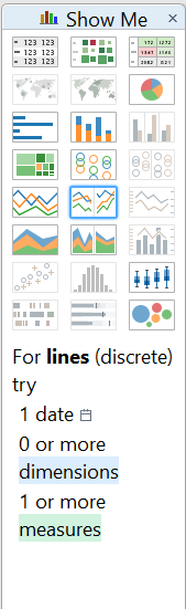 We need at least a date field (discrete) and a measure to build a basic, discrete line chart. Let's do this using the Superstore dataset shipped with Tableau. Just doubleclick on the Order Date field and notice that Tableau by default puts it to the Columns shelf as a discrete date field. Our measure is Sales.
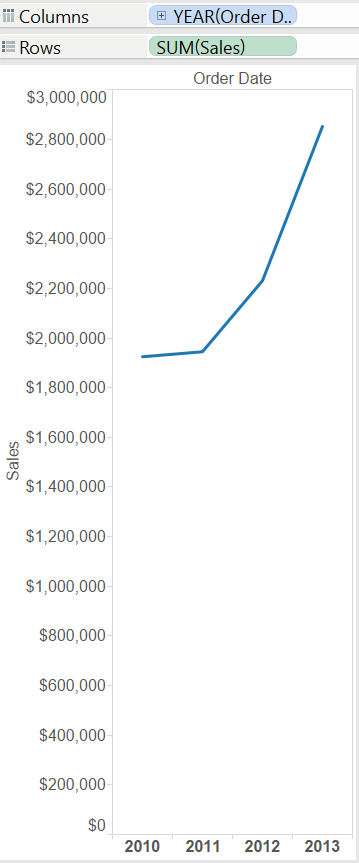 Tableau handles date fields intelligently so that we can expand the date hierarchy behind the years, drilling down to months. Removing the quarters we see that the line of the sum of sales is drawn at monthly level, split by years.
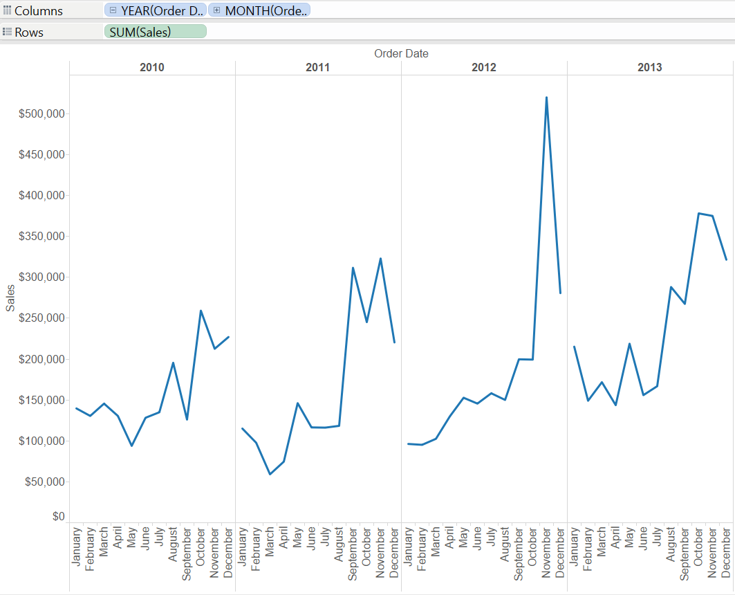 These are the basics of discrete lines in Tableau. As always, we can enrich this view by adding another dimension (e.g. Region on the Colour button on the Marks card) or we can display multiple measures using the combination of Measure Names - Measure Values. Both options are outlined at the end of our preceding Show Me How post, Continuous lines.Line charts are within the top three most useful and most frequently applied graph types (my top three is bar charts, tables and line charts, not ordered in any way). So it is great that Tableau's 'Show Me' supports us with two built-in versions: discrete and continuous lines.
We need at least a date field (discrete) and a measure to build a basic, discrete line chart. Let's do this using the Superstore dataset shipped with Tableau. Just doubleclick on the Order Date field and notice that Tableau by default puts it to the Columns shelf as a discrete date field. Our measure is Sales.Tableau handles date fields intelligently so that we can expand the date hierarchy behind the years, drilling down to months. Removing the quarters we see that the line of the sum of sales is drawn at monthly level, split by years.These are the basics of discrete lines in Tableau. As always, we can enrich this view by adding another dimension (e.g. Region on the Colour button on the Marks card) or we can display multiple measures using the combination of Measure Names - Measure Values. Both options are outlined at the end of our preceding Show Me How post, Continuous lines.Line charts are within the top three most useful and most frequently applied graph types (my top three is bar charts, tables and line charts, not ordered in any way). So it is great that Tableau's 'Show Me' supports us with two built-in versions: discrete and continuous lines.