

8 January 2017
I came across an interesting challenge the other day while I was working on a client project. Although Tableau already allows users to highlight with colour legends, a filter is trickier. You could create a separate sheet and use that with a filter action (see community post here). However, in order for this hack to work, the field you are using to colour your data needs to be a dimension. What if you are colouring your data by a calculated field?Let me illustrate the problem with the go-to sample superstore data. Let’s say we want to see a scatter plot that breaks our customers into quadrants based on sales and profit. Something like this: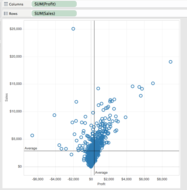 Next, we colour the individual quadrants using the following calculation:
 Wait, whoa, what’s going on here? Why the nested LOD calculations? Why make it so complicated? Well, what we’re essentially doing here is writing a calculation for WINDOW_AVG. So if we were using WINDOW_AVG, the calculation would look like this:
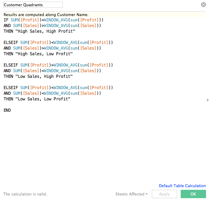 So why not just use WINDOW_AVG? Table calculations have their limitations and do not cooperate with many Tableau features. One of these features is sets. Continue reading to see why this is a problem in creating custom colour legend filters.If we drag our nested LOD calculation onto the colour shelf, we get four coloured quadrants:
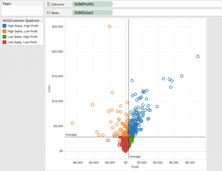 We would also like to see a list of our customers based on the quadrants they fall into:
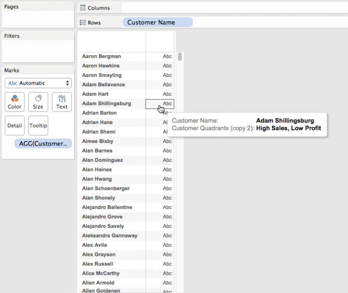 As you can see in the screenshot above, we’ve got a list of our customers with the quadrants calc we used to colour the scatterplot included as a detail. However, if we create a new dashboard, clicking the colour legend still only highlights customers, it doesn't filter them:
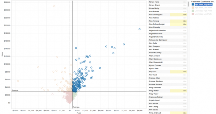 Using the method outlined in the community post here, we can use a colour legend as a filter by creating a new sheet that mimics the design of a colour legend. Remember how we could have done our quadrant colouring calculation with a simple WINDOW_AVG? Well, this is what happens when we try to create a colour legend sheet with such a calculation:
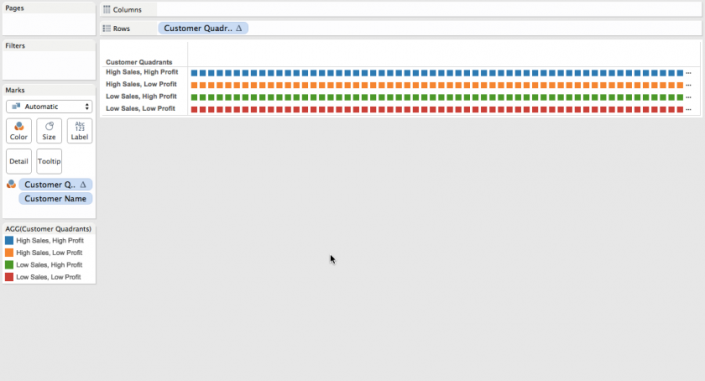 WINDOW_AVG is a table calculation that needs Customer Name as a level of detail to calculate. The problem is, we end up with too many squares. The solution? Sets. And sets don’t like table calculations. Hence, the long, drawn-out, nested LOD calc.To remedy the situation, create Customer Name sets for each of the quadrants. You can do this using the calculation we used to colour our quadrants. For example, a High Sales, High Profit set would look like this:
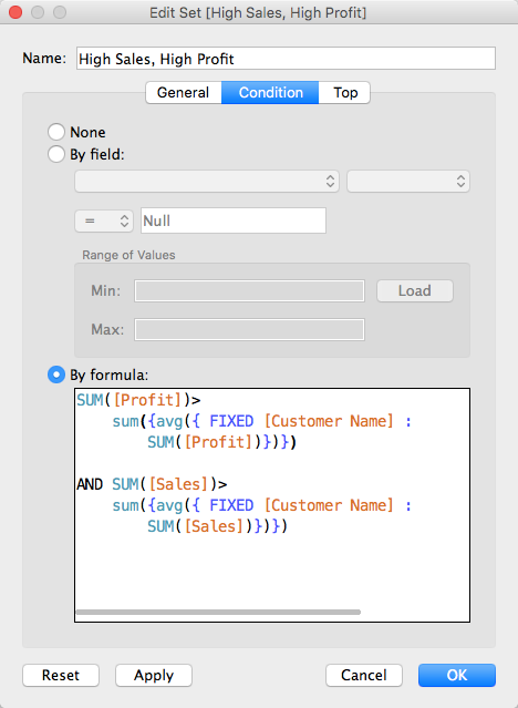 Once you've created all four sets, drag them onto the detail shelf of your customer names sheet. Then, create a new calculation with the following:
 Drag this calculation onto the detail shelf in your scatterplot and customer names sheets. Create a new sheet and drag the same calculation onto the rows shelf and the colour shelf. You end up with something that looks like a colour legend. Put everything together on a dashboard and add the following actions: 1. Add a filter action between your legend sheet and name list, 2. Add a highlight action between your legend sheet and your scatterplot. You end up with something like this:
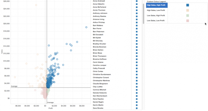 Now you have a dashboard that gives you a list of customers broken down into quadrants. A useful tool for segmentation analysis, and a good way to practice the utility of sets in Tableau.
Next, we colour the individual quadrants using the following calculation:Wait, whoa, what’s going on here? Why the nested LOD calculations? Why make it so complicated? Well, what we’re essentially doing here is writing a calculation for WINDOW_AVG. So if we were using WINDOW_AVG, the calculation would look like this:So why not just use WINDOW_AVG? Table calculations have their limitations and do not cooperate with many Tableau features. One of these features is sets. Continue reading to see why this is a problem in creating custom colour legend filters.If we drag our nested LOD calculation onto the colour shelf, we get four coloured quadrants:We would also like to see a list of our customers based on the quadrants they fall into:As you can see in the screenshot above, we’ve got a list of our customers with the quadrants calc we used to colour the scatterplot included as a detail. However, if we create a new dashboard, clicking the colour legend still only highlights customers, it doesn't filter them:Using the method outlined in the community post here, we can use a colour legend as a filter by creating a new sheet that mimics the design of a colour legend. Remember how we could have done our quadrant colouring calculation with a simple WINDOW_AVG? Well, this is what happens when we try to create a colour legend sheet with such a calculation:WINDOW_AVG is a table calculation that needs Customer Name as a level of detail to calculate. The problem is, we end up with too many squares. The solution? Sets. And sets don’t like table calculations. Hence, the long, drawn-out, nested LOD calc.To remedy the situation, create Customer Name sets for each of the quadrants. You can do this using the calculation we used to colour our quadrants. For example, a High Sales, High Profit set would look like this:Once you've created all four sets, drag them onto the detail shelf of your customer names sheet. Then, create a new calculation with the following:Drag this calculation onto the detail shelf in your scatterplot and customer names sheets. Create a new sheet and drag the same calculation onto the rows shelf and the colour shelf. You end up with something that looks like a colour legend. Put everything together on a dashboard and add the following actions: 1. Add a filter action between your legend sheet and name list, 2. Add a highlight action between your legend sheet and your scatterplot. You end up with something like this:Now you have a dashboard that gives you a list of customers broken down into quadrants. A useful tool for segmentation analysis, and a good way to practice the utility of sets in Tableau.