25 February 2014
Long time followers of the Information Lab blog may remember Andrew Ball's post - Radar Charts in Tableau – part 1 - back in May. It's long overdue that we return to the subject and look with fresh eyes now we have Alteryx in our toolkit.We've been documenting a lot recently how Alteryx can help with common Tableau data cleansing tasks and creating radar charts is no different. For the Top Trumps Viz below I decided to use radar charts to compare the different characters in the set of cards and their attributes.Firstly I need to standardise the value attributes so I summarised the variables to find the minimum and maximum values and attached those back to the data, then creating a standardised value between 0 and 1 was simple using the formula: Andrew's post lays out the rest of the details and so I won't go into them here, here is my final Alteryx implementation to clean and build the data for the Viz:
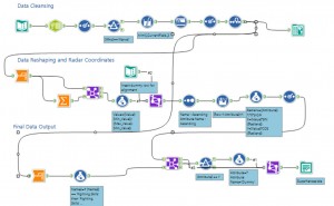 The only things to add to Andrew's post are that I created a dummy value (a hero called 'Chris'), with all the values as 1, which made lining up the template radar picture in Tableau an easier process. It meant I could tweak the X, Y coordinates and get the radar exactly right - then hide the dummy row in my final analysis:
([Value]-[Min_Value])/([Max_Value]-[Min_Value])
Next I simply needed to number each attribute 1 - 6 according to the spoke they took on the radar and, remembering SOHCAHTOA from my high school maths, then write the following formulae in the tool: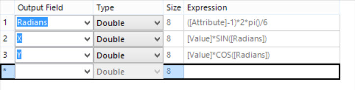 Andrew's post lays out the rest of the details and so I won't go into them here, here is my final Alteryx implementation to clean and build the data for the Viz:
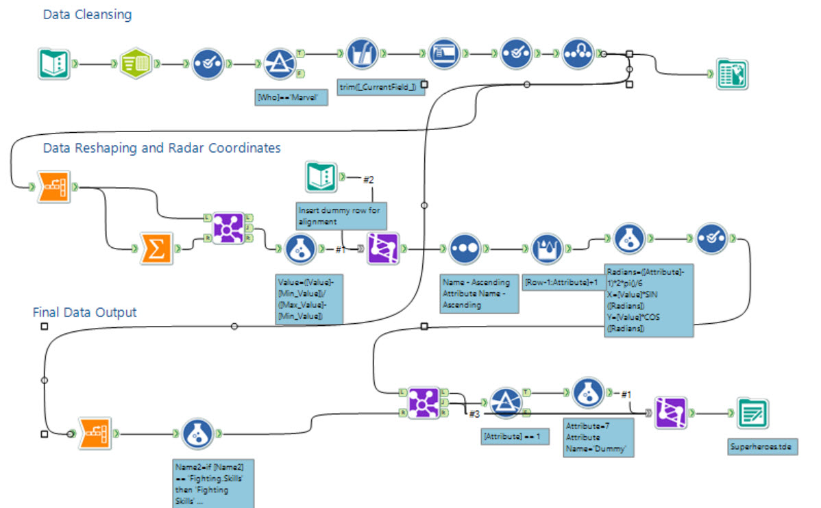 The only things to add to Andrew's post are that I created a dummy value (a hero called 'Chris'), with all the values as 1, which made lining up the template radar picture in Tableau an easier process. It meant I could tweak the X, Y coordinates and get the radar exactly right - then hide the dummy row in my final analysis:
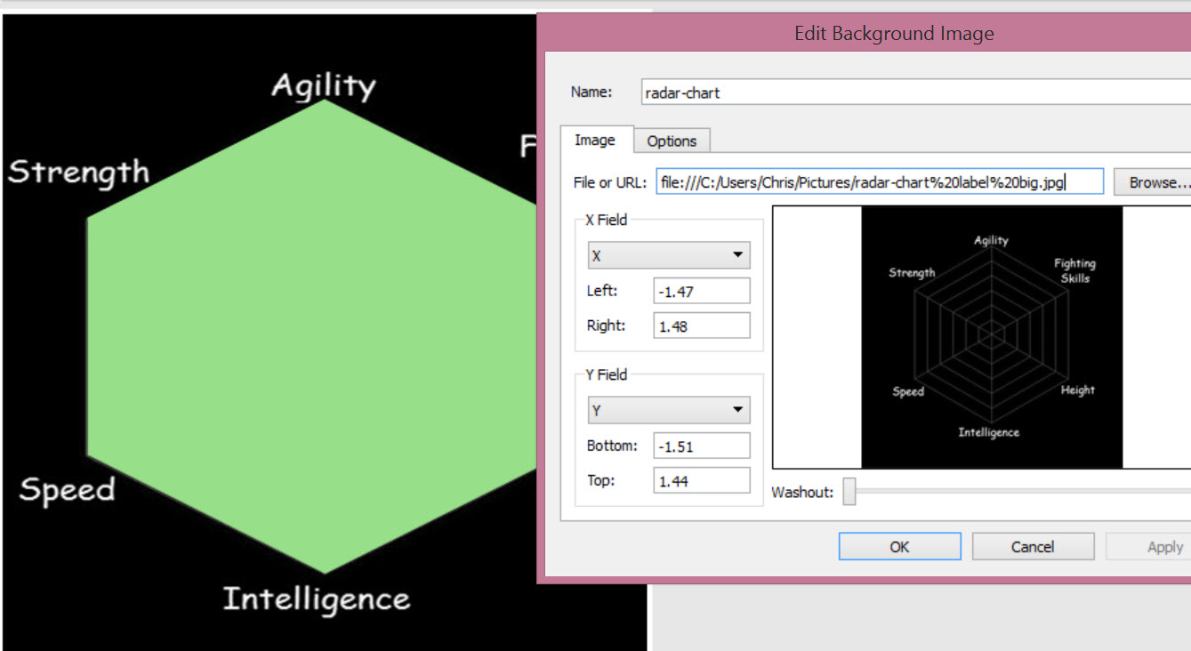
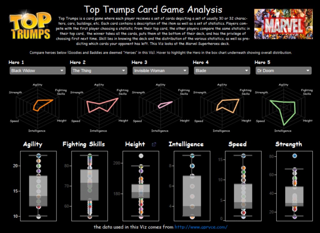
The 'Top Trumps' Viz
The idea for the viz came from a game I was playing with my eldest son, I was trying to teach him some of the nuances of Top Trumps, he's only 5 years old and so in his mind choosing the highest value (Height in this case) was the best way of playing, even when the height for that card was the lowest in the overall set of heights. I thought about ways of showing him the comparisons between the cards and thus the viz was born. Thankfully the data was online and publicly available and so I was able to produce the viz in Tableau Public and share it.Radar vs Parallel Plots
Radar charts were a choice I made based on my requirements, I want to see which attributes in my card are better as a whole, based on a quick, holistic view in comparison to other cards. Whether a parallel plot is better I think will be a matter of debate, on the whole it's certainly easier to quickly compare a given attribute across the five chosen heroes, so I've also included an alternative view including a parallel plot for those who prefer to work with those.Click below to see the final viz.