

8 March 2017
A client asked me to come up with a dashboard that would pull together ratings from different reports into one overall rating for two areas of the business. Taking design inspiration from the tram network map in Zurich I came up with this diagram to bring some style to an otherwise dull dashboard. This chart can be built as a stand-alone then coloured by another data-source that you have in Tableau by creating linking relationships. Here's an example I built using Superstore data:[iframe src='https://public.tableau.com/profile/daniel.watt#!/vizhome/Piechartwithconnections/Piechartwithconnections?:embed=true&:display_count=yes&:showVizHome=no&:toolbar=no' width='654px' height='819px' scrolling='no']And here's how you build it: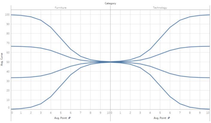

1a. Create a table with points
You need to define a category and subcategory that you have in your data so you can create relationships later on. You also need to set the position on the y axis that you want the connectors to end up, between 1 and 100. Here is the table I created: Connectors.1b. Pivot the data
You can do this in Tableau or in excel using the tableau plug-in for excel. You need to pivot all of the Point fields (Point 0 to Point 10), then rename pivot fields and pivot values as Point Group and Point.1c. Create relationships to your original data
Add the connector source as a separate data source to the data you want to visualise (in my case Superstore). Then click data, edit relationships to check the relationships are set up how you want. In my example Category was matched automatically but sub-category needed to be added manually as I did not have the case the same as superstore.2. Create a calculation called Curve
case [Category]when 'Technology' then[Position] + (50-[Position])*(1/(1+exp(1)^([Point]-5)))when 'Furniture' then[Position] + (50-[Position])*(1/(1+exp(1)^(5-[Point])))EndThis is adapted from the calculations in Jeffrey Shaffer's blog.3. Drag the fields onto the sheet
- Category and avg(Point) on columns
- Avg(Curve) on rows
- Sub-category on detail
- Point on path
Add the semi-circles
The appearance of a pie in the middle of chart is actually just two circles sitting at 10,50 and 0,50 which are cut off by the y axis. To get these first create a calculation called Circle Xcase [Category]when 'Furniture' then 10when 'Technology' then 0ENDThen drag this onto the second x axis as Avg([Circle x]). Make it dual axis then manually fix both x axis from 0 to 10. On the marks card for the Circle X axis, change the mark type to circle and remove Sub-category and points from detail. Your sheet should now look like this:Add colour or line thickness
To add colour or sizing, on the side bar click on Superstore (or the datasource you want to use for colour). You should see red chain icons next to your linked dimensions. If not, you need to check your relationships as mentioned earlier. You should now be able to drag measures (such as sales and profit in superstore) onto the view to add thickness and colour. Remember you will need to colour both axis separately.Remove the chart junk
As this is just supposed to look like some connectors, we can hide all headers, gridlines, axis, zero lines and row dividers. A white column divider may look good to split the central circle.Further optionsIf you want your lines to look better, then add more points to the original excel table. What looks best depends on the size