

10 March 2015
Every year Tableau have a set of competition to find their three Iron Viz competitors for the Tableau Conference. The start of this years set has just been announced and has the theme of 'found data' from Wikipedia.I have decided to enter and you can find my entry below, click on it to enter the interactive version.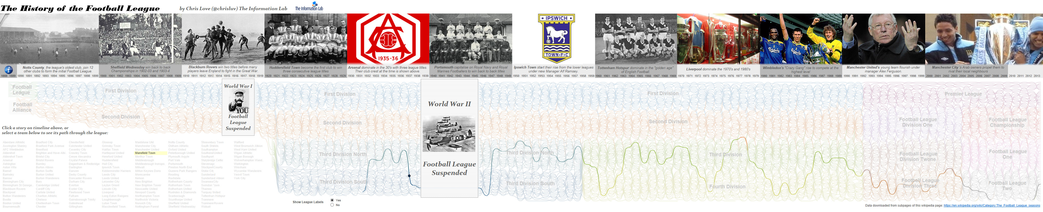
 Later, this is as I was developing the story I had this. Note the design is there but the story element hasn't grown into what it became, I was hoping to float transparent text over each image but as Tableau doesn't support transparent workbooks I had to change my plan.
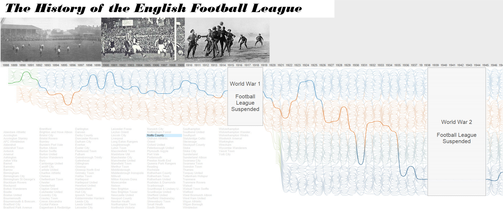
 I cannot stress enough how important it is to source images in an ethical way, stealing someone else's image from the internet without their permission is not cool.With the images sourced I turned to Photoshop to create my header image to add a few tweaks that would have been hard in Tableau, namely:
Inspiration
No idea is new and this is definitely true in data visualisation, we absorb and learn as we find new and interesting content in our field and so it would be fair to say the idea for this visualisation was seeded from several others I've seen over time. Here are a few that spring to mind but there are a great many more:Fifa World Rankings - I saw this Viz last year and immediately fell in love with it, I remembered it after I started my own Viz so guess it had always been at the back of my mind.Tracing the History of NCAA Conferences - This fantastic viz was featured in one of the talks featured at #tapestry and it set the seed for this latest Viz. You can probably see how.State of America Rankings - My research in Sankey last week for the blog took me to this great looking visualisation by Jeffrey ShafferI didn't look at these visualisations while building mine, but looking back at what might have inspired me it's very clear the influence they had on my design in many different ways. I love the way the community shares and influences each other in this way.Design and Iteration
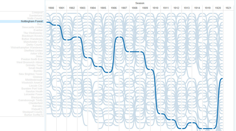
It's worth saying that my initial idea didn't look like this in my head - the idea of the bump chart was there, along with a story element but I imagined having more room to tellthe story without the clicks to reveal. However as the visualisation evolved and I built it out I found the space I had shrinking. I quickly turned to a side scrolling viz (which I've seendone well) but found the space limiting, I also realised I had loads of white space at the start to drop my list of teams - a quite accidental area I was able to make good use of. I lovethe way tableau allows me to design and build something so quickly that I can design and iterate 'on the fly' without breaking my flow of analysis and story telling.My first half hours work:Later, this is as I was developing the story I had this. Note the design is there but the story element hasn't grown into what it became, I was hoping to float transparent text over each image but as Tableau doesn't support transparent workbooks I had to change my plan.Data Acquisition
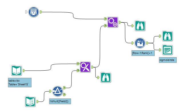
Now the painful bit, a confession, I found no quick way to grab the data from Wikipedia. I did spend an hour with different methods (Alteryx, Kimono labs, Import IO) before I realised the acombination of inconsistent data formatting and lots of text surrounding the data meant it may just be quicker to copy and paste all the tables. That's over 100 pages of data, but it onlytook a couple of hours. I did it directly into Excel, deleted the intervening rows and added the league names as an extra column as I went. As a person who tends to enjoy over engineering solutions I was pleased that my decision actually looks like it saved me time.Data Manipulation
Next I created an overall rank in Alteryx and also duplicated the data to create the sloping bump lines (more on this later), before outputting to tde. Alteryx wasn't essential here butit's my tool of choice - I could equally have spent longer in Excel and got the same effect (I prefer to get out of Excel asap these days - Alteryx on the other hand is a joy to use).Performance
There's not a lot of data but there are a lot of marks on the page and over a hundred axes, incorporating the actions I built to highlight the data this meant performance started to become an issue and I had to take a few steps to pare back my visualisation. As always this became a compromise between aesthetics and story vs user experience, here's what I did:- my 'bumps' originally took 49 marks between years, I lowered this to just 13. While this means you can make out individual line segments it means performance is much better.
- I moved my Viz into Tableau v9 Beta, this improved performance dramatically and since Tableau Public is on v9 I was still able to publish.
Design
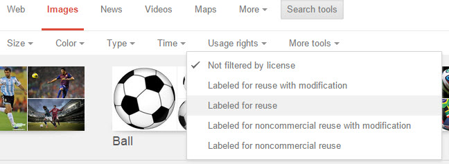
I wanted the design on this Viz to look hot, I mean really hot. I sourced some non-copyright images off the internet (a google search with the Search Tools is really helpful here):I cannot stress enough how important it is to source images in an ethical way, stealing someone else's image from the internet without their permission is not cool.With the images sourced I turned to Photoshop to create my header image to add a few tweaks that would have been hard in Tableau, namely:- I added a slight gradient to the bottom of the images
- I amended my axes so that they had a transparent colouring every ten years
- I blended the images together into a single header for performance reasons
- I created a smooth title in a nice font - Tableau Public has a limited range of fonts