A question was posed recently within The Information Lab's network as to how one could go about creating a 'reference box'; a shaded square on a scatterplot opposed to having two bands that go the entire way across the chart.
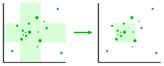
In response, Brian Scally hypothesised that you could use further reference bands to cover up the extra shaded areas to turn shaded bands into a shaded box.
After a little tinkering I've come up with the following solution and created an interactive Tableau Public guide to walk you through the process of making your own.
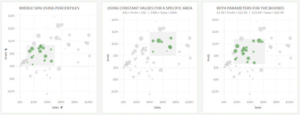
Before diving into the content, its worth highlighting that reference boxes have more use than just a technical exercise. As seen in the viz above, they are great at drawing the eye to specific areas of interest, demonstrate the range of possible values of interest, and minimise visual clutter when compared to using reference bands.
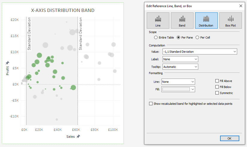
To begin adding a reference box to your scatter plot, first add a reference band or distribution band to the x-axis of the chart.
Set the fill colour to your desired box colour and leave the other formatting settings untouched.
You probably also want to untick 'Show recalculated band...' too.
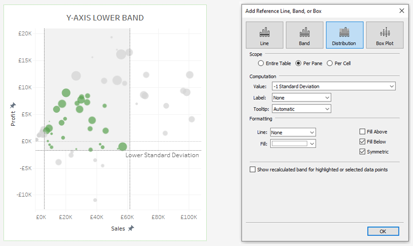
Next set up a reference line or single value distribution line on the y-axis with the value set to the y value for the lower bound of your box.
In the image below, the computation value is -1 Standard Deviation as we're filling in below the box.
Select 'Fill Below' and 'Symmetric' ('Symmetric' only required for distributions) and then set the fill colour to the background colour of your chart.
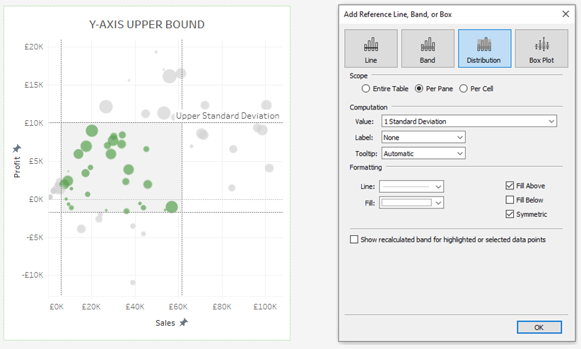
Finally, add a second reference line or single value distribution line on the y-axis with the value set to the y value for the upper bound of your box.
In the image below, the computation value is 1 Standard Deviation as we're filling in above the box.
This time, tick 'Fill Above' (and 'Symmetric' if applicable) and again set the fill colour to the background colour of your chart.
You've now made a dynamic reference box that'll adjust as you filter or change the detail level of your chart!
To summarise, reference boxes are a combination of a reference band on one axis and two reference lines on the other with the appropriate fill settings.
You can experiment and find ways to create and utilise them to suit your needs.
Below are examples of a box using percentiles, a box using constants to focus on a key area, and (with a few parameters and extra calculations) an adjustable reference box too.