Following up on my time at Tableau Conference, here’s another quick tip.
Clustered Bar Charts (The Easy Way)
This technique is another one from Jeffrey Shafer. There are plenty of tutorials out there for clustered bars, but this method is very simple to implement.
Step by step
Start with a regular bar chart of your choosing:
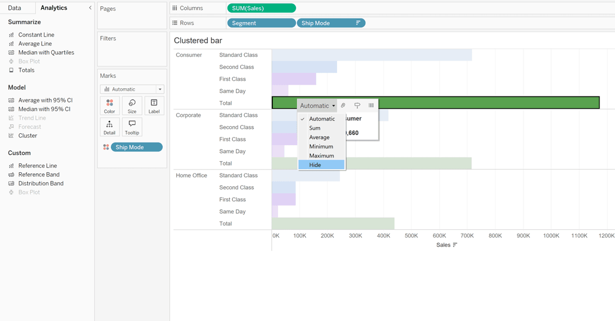
Drag in your subtotals from the analytics pane:
Once these are in, click on your total and choose ‘Hide’:
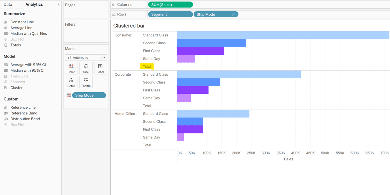
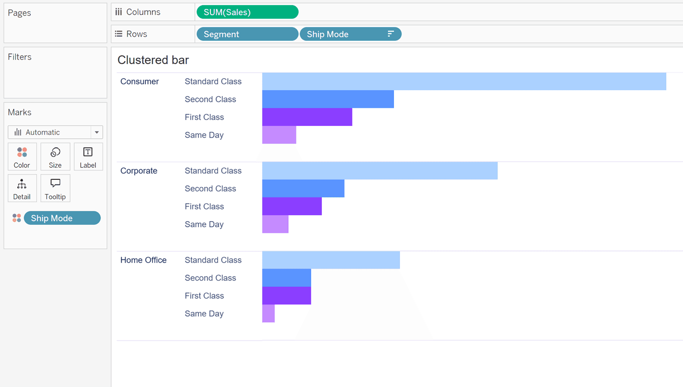
Now it should look like the image below. If your Grand totals are also showing you can turn these off in Analysis -> Totals. We’re nearly there, but the ‘Total’ label is still showing.
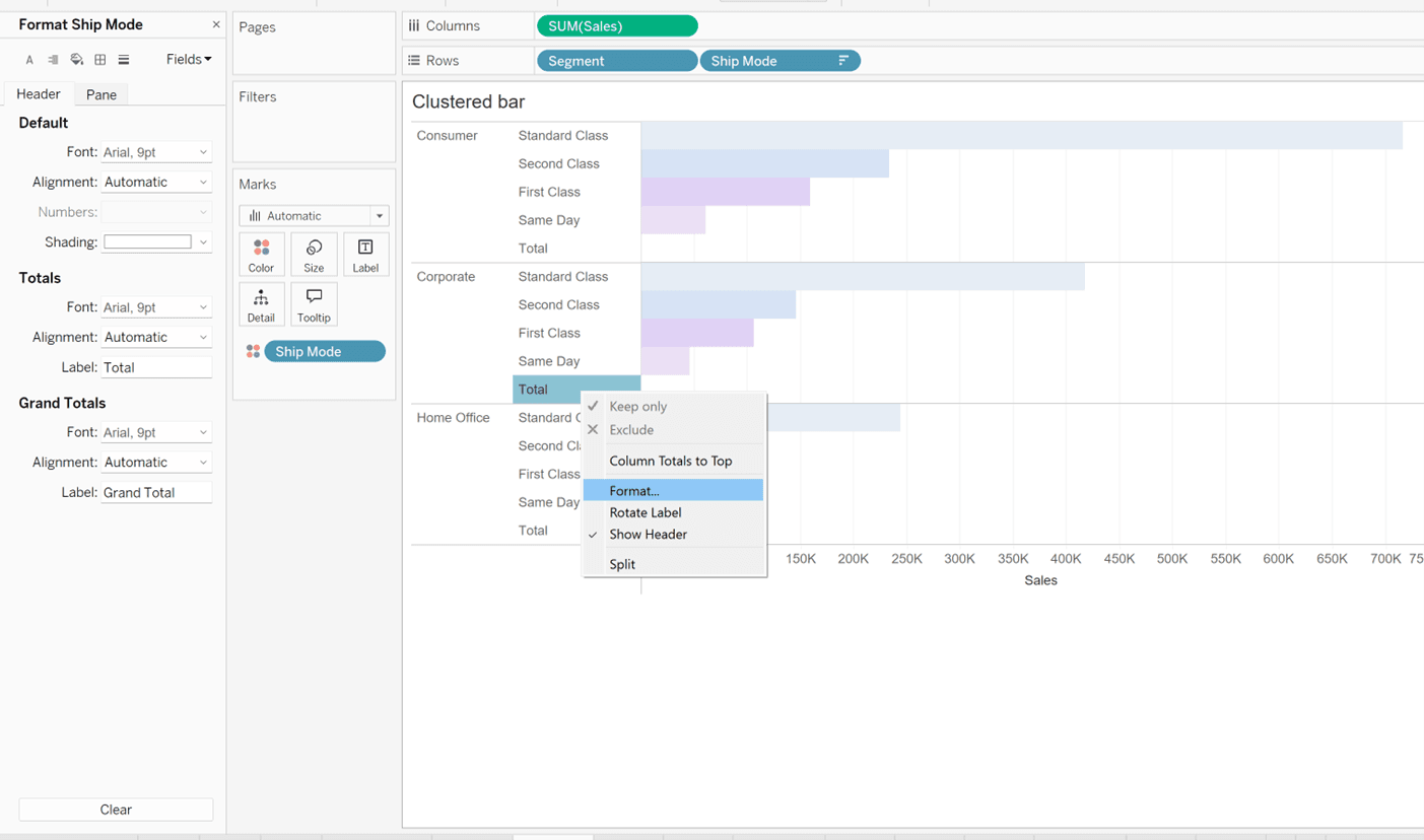
So, right click, select format and navigate to this view in the formatting pane.
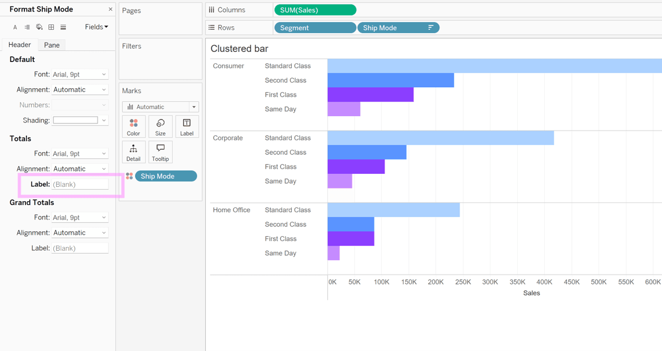
Under Totals -> Label, where it says ‘Total’, delete this text, so it appears blank. Then you should have this view:
Apply some formatting if you need it, and then you’re done!
To see these tips in action, you can download my TC dashboard on Tableau Public.