


Following on from How to Create Diagonal Reference Lines in Tableau (Part 1 – Scatterplot). It can also be useful to add a diagonal reference line to show a growth target on a time series graph. This can be used as a benchmark actual sales against the growth target shown as line on the graph.
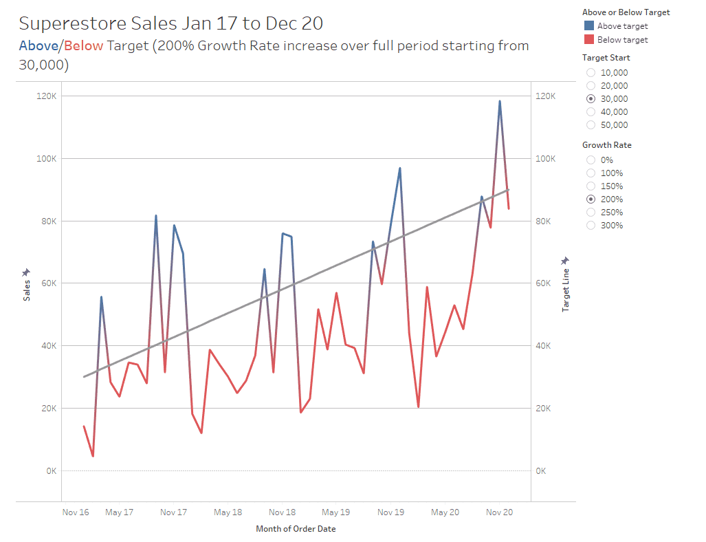
In this example let’s assume that you are retrospectively evaluating sales and you wish to compare the actual sales compared to an increase of X% from a given starting value. This will be user definable through parameters and we will use a target starting point of 30,000 with a 200% growth rate across the period (the target line will start at 30,000 and end at 90,000).
The Logic
Creating a dual axis against the same measure on the opposing axis will act to plot a target line on a graph according to the equation y = mx + c
y = the calculated field we are creating
m = gradient of the line (∆y / ∆x) = (y2 - y1) / (x2 - x1) i.e. for each x along how many y up.
x = Date converted into a number this is a calculated field in (2) [Date Part for Month]
c = is the y-axis intercept (y value when x = 0)
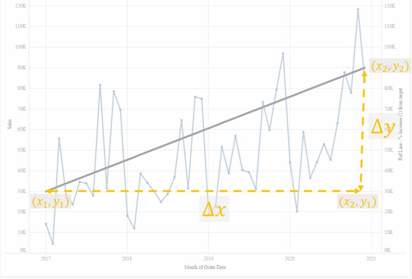
In order to draw our reference line we need a technique to get calculated fields for the x1, x2, y1 and y2 fields. These will be shown in the method below.
Method
Data source: Sample - Superstore
Workbook to follow along can be found here
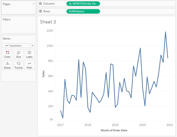
1) Create the starting view
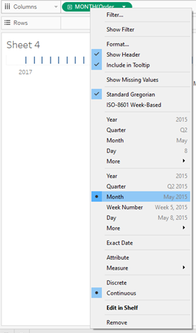
i) Bring [Order Date] to columns and select the second Month option (this is month as date truncated and converts the dimension to continuous).
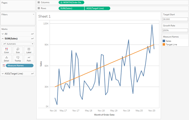
ii) Bring [Sales] on to rows and you should end up with a time series plot like this.
2) Create calculated field to convert data type from a date to a number. We do this as we create a dual axis against the same measure on the opposing axis and as the opposing axis is [Sales] which is a double-precision floating-point number, we need to convert our dates to a number data type as well. This calculated field is seen below and we will call this [Date Part for Month]. This creates a field which goes from January 2017 (which would have the value 0) to December 2020 (which would have the value 47).
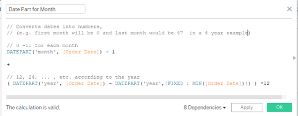
[Date Part for Month] =
// Converts dates into numbers,
// (e.g. first month will be 0 and last month would be 47 in a 4 year example)
// 0 -11 for each month
DATEPART('month', [Order Date]) - 1
+
// 12, 24, ... , etc. according to the year
( DATEPART('year', [Order Date]) - DATEPART('year',{FIXED : MIN([Order Date])}) ) *12
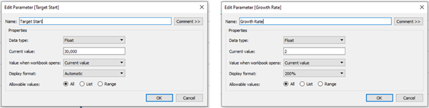
3) Create the parameters. Create a [Target Start] parameter and [Growth Rate]
4) Create x1 and x2. Looking back at the diagram in the logic section, in order to get the gradient of the target reference line we need to create calculated fields for x1 and x2. We use nested FIXED level of detail (LOD) expressions to isolate the first and last value of the [Date Part for Month] this is 0 and 47 (x1 and x2 are the same value for every month of data).
[x1] =
{FIXED : MIN(
IF
{FIXED : MIN([Date Part for Month])} = [Date Part for Month]
THEN
([Date Part for Month])
END
) }
[ x2] =
{FIXED : MIN(
IF
{FIXED : MAX([Date Part for Month])} = [Date Part for Month]
THEN
([Date Part for Month])
END
) }
5) Create y1 and y2
i) [y1] is the [Target Start] parameter (currently set at 30,000)
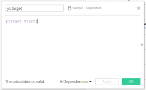
[y1] = [Target Start]
ii) [y2] is what the final value will be according to the chosen growth rate (e.g. in this example: 30,000 + 2*30,000 = 90,000)
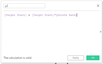
[y2] = [Target Start] + [Target Start]*[Growth Rate]
6) Create the [Target Line] calculated field according the equation from the logic section
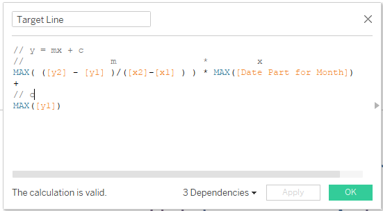
[Target Line] =
// y = mx + c
// m * x
MAX( ([y2] - [y1] )/([x2]-[x1] ) ) * MAX([Date Part for Month])
+
// c
MAX([y1])
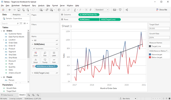
7) Bring the [Target Line] on to the view. Drag [Target Line] on to the Rows shelf, right click the [Target Line] pill and select Dual Axis and be sure to right click on the right hand side y-axis and select Synchronise Axis.
We should then see our reference line start at the chosen value in the parameter of 30,000 and the last value at 90,000 as we chose a 200% growth rate over the period.
8) Colour if [Sales] is greater or less then chosen target. Create a calculated field to determine if the [Sales] is greater than [Target Line].
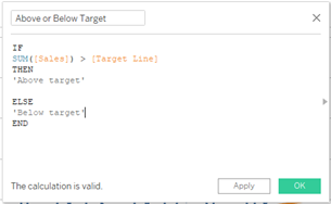
[Above or Below Target] =
IF
SUM([Sales]) > [Target Line]
THEN
'Above target'
ELSE
'Below target'
END
9) Add colour to the time series line. Drag [Above or Below Target] to Color on the [Sales] shelf, remove [Measure Names] from Color on the [Target Line] shelf and you should have the final outcome.
Change the [Target Start] and/or [Growth Rate] parameters to adjust the target line as you wish and you can further format the view to get to your final desired outcome!
N.B the calculations to create the [Target Line] use FIXED LOD’s so make sure to add any filter to context if you wish for the reference line to re-start for that chosen range in the filter.