

5 November 2015
I have a dataset of my friend's progress through job interviews here in the UK. They saw the Sankey I had built before and went through the effort to build a dataset so I could visualize their progression as a Sankey chart.Here it is for you to take a look: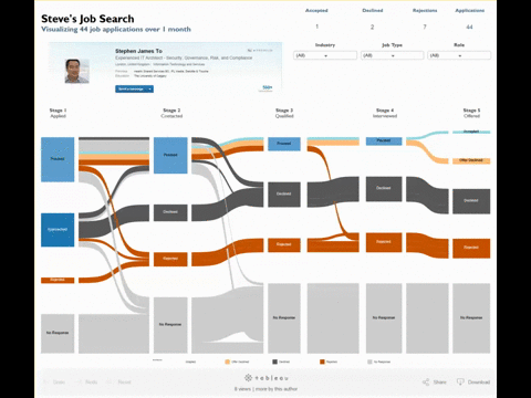 Especially with this dataset, statuses at the beginning will not appear at the end. For instance, you can only be approached once-- in stage 1. Also, you can only accept 1 offer. Overall, it get confusing. So I turned to tooltips to convey greater clarity about the situation.But the problem with putting the label directly into the tooltip is that it doesn't neccesarily help audiences better understand the situation described in the viz. For example, in Stage 1 where steve was 'Approached'. Once I tell you it means he was approached by a recruiter, it makes 100% sense but using that as the actual label would be 1) a pain to go back into the dataset or 2) way too many words for a label.So I created a workaround - create a specific 'label' for tooltips!
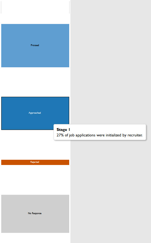 Step 1) Create the calculation with if statements
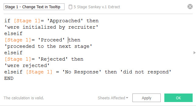 Step 2) Put the calculation on tooltips
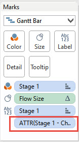 Voila! You're done!
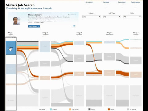
Especially with this dataset, statuses at the beginning will not appear at the end. For instance, you can only be approached once-- in stage 1. Also, you can only accept 1 offer. Overall, it get confusing. So I turned to tooltips to convey greater clarity about the situation.But the problem with putting the label directly into the tooltip is that it doesn't neccesarily help audiences better understand the situation described in the viz. For example, in Stage 1 where steve was 'Approached'. Once I tell you it means he was approached by a recruiter, it makes 100% sense but using that as the actual label would be 1) a pain to go back into the dataset or 2) way too many words for a label.So I created a workaround - create a specific 'label' for tooltips!Step 1) Create the calculation with if statementsStep 2) Put the calculation on tooltipsVoila! You're done!