

3 December 2014
It is slightly ironic that while preparing last weeks post for the Show Me How series on Heat Maps in Tableau I was also preparing this, rather more complex post, on another form of heat mapping in Tableau - this time in the form of chloropleth maps.Heat Mapping in this sense is straightforward in Tableau when in the form of Polygons datasets or points in just a few clicks, however it can be difficult to achieve any sense of further geographic analysis such as thematic gradients. In this post I want to explore I have worked around that problem using Alteryx, and show you how you can use a simple web application built in Alteryx to do the same.
 Where something is hard or impossible in Tableau then I like to take it on as a challenge.
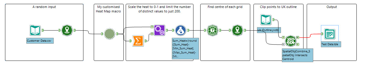 The result for this test file in Tableau was a start but with more work I knew I could improve it. As you can see each point is replicated as a small dot in Tableau - like a pixel.
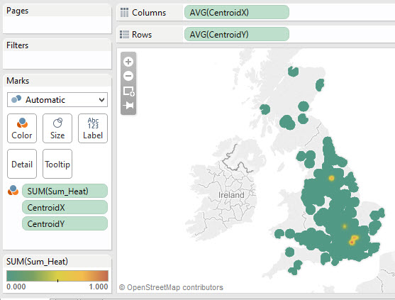
 Enjoy creating your own heat maps, and please pass on any feedback via Twitter (@ChrisLuv) or in the comments below.
Easy in Tableau
(stay tuned to our Show Me How series to find out how to produce these)
Hard / Impossible
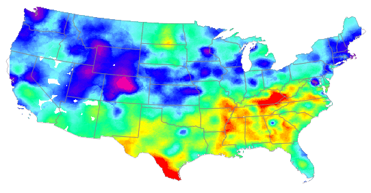
The below thematic gradient map is difficult, especially where we only have point data. It shows areas of high concentration as a deep red, and low concetration as a blue - hence the heat map naming (hot -> cold). In this case the map below is actually showing temperature, but similar maps can be used to show population, etc.Where something is hard or impossible in Tableau then I like to take it on as a challenge.Alteryx to the Rescue
Many of our regular readers will be familiar with my love of Alteryx and what it allows me to do with Tableau that just wouldn't be possible otherwise. This is definitely even more true in the geospatial world, Alteryx beats any other piece of BI / analytics software you care to name hands down when it comes to producing data for mapping.If we have some points of data we want to convert into a heat map the process is actually quite complex, here are the steps:1. Build a grid of data points, the size of the is dependent on the resolution of the map needed.2. For each grid square (X):a. Find the data points within that grid square X and sum their 'heat' (e.g. sum their population)
b. For the neighbouring grid squares add their data points heat but reduced by a factor that is inversely proportional to the distance from grid square X.
Imagine doing this for many thousands of grid squares that might make up the UK or US and you can quickly see why it may be difficult and time consuming. I've flirted with the Table Calculations needed and it's not straightforward, especially if you don't have a pregenerated grid of data - which we don't in most cases!Thankfully a lot of this logic is already written into the 'Heat Map' tool in Alteryx, however it only creates a 5 polygons containing points of similar 'heat' for use as shape files or reports in Alteryx - useless from a Tableau point of view.Customising Alteryx Tools
One of the many things I love about Alteryx is that many Alteryx Tools are in fact 'macros' - meaning we can customise and edit those - and so we can edit the Heat Map tool for our purposes. That is exactly what I have done, the macro was well annotated and so I removed the pieces I didn't need, mainly it was a case of simply removing the 'Tile' tool and the latter part of the module. Then I saved a custom version - I love it that Alteryx make it that easy to steal and customise their experts work.Then I imported my data and tested it, here was my test module:The result for this test file in Tableau was a start but with more work I knew I could improve it. As you can see each point is replicated as a small dot in Tableau - like a pixel.A Real Use Case
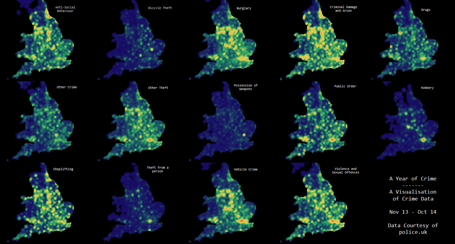
To really test out this macro I wanted to put it through it's paces with some real data - so I downloaded data from police.uk of every crime recorded in the UK from November last year. I then broke out the results by crime and used a 'batch macro' in Alteryx to run the process multiple times, looking at weighted differences with regard population density (so it didn't just show a map of population - as can happen when showing frequency of occurences) and produced the data for several categories - which was then combined into a single file and visualised in a Tableau workbook. Click to see the workbook on Tableau Public.Example Modules
You can download my macro and modules for the Test data here.Build it yourself via this Free Alteryx Web Application
If you want to experience Alteryx yourself for 14 days you can using the free, easy to install trial but you can also experience the power of Alteryx via their web gallery. Just register and you can use this app I've put together to generate the data behind these maps yourself using your own data simply and easily. Give it a try, here, and you will find the app - fill in the details and run to get your tde of heat points ready to use in Tableau, use the workbook in the link above for details of how I then generated the viz in Tableau:Enjoy creating your own heat maps, and please pass on any feedback via Twitter (@ChrisLuv) or in the comments below.