


I was recently asked to put together a presentation with the title 'Elevating Dashboards for Decision Making'. This presentation was delivered at the first TIL Summit on 12th September 2024. Following the event I thought it made sense to compile my presentation into a blog post for future reference.
How to Elevate a Dashboard to aid the Decision Making Process:
There are three key concepts that you can follow to help design or improve a dashboard into one that is production ready. These are:
Audience & Requirement Gathering
Chart Types
Interactivity & Formatting
Audience
Just like in storytelling, understanding your audience is crucial in designing effective dashboards. If you don't think about who you're designing for your dashboard will likely lack purpose. Having said that, there is no 'one size fits all' solution to dashboards, every stakeholder has different needs. For example:
Executives might need high-level summaries with key performance indicators to take to board meetings.
Managers may want to drill down a bit more into specific metrics and trends.
Analysts might require more detailed views to explore and manipulate data as well as drill into key areas of interest.
Understanding who will use the dashboards, what their goals are, and how they prefer to consume data is the first step in creating a effective dashboard which will help drive decisions.
Requirement Gathering
So, once we know who we're creating our dashboard for we can now think about why they need one in the first place.
Requirement gathering is essential to ensure your dashboard aligns with business goals, meets user needs, includes relevant data and is designed for optimal usability.
It is clear when a dashboard has been built without this step as they either don't answer any questions or are trying to answer all possible questions causing the dashboard to be a mess and overwhelming.
When requirements are well-defined, dashboards are more likely to provide appropriate insights for the decision-making process.
Chart Types
So we've got our audience and understand their needs, now we need to find the right visualisation types. The type of chart or graph you use should align with the data you're presenting. The goal is to make the data as clear as possible by avoiding clutter and choosing visualisations that best convey the message.
A note on tables:
Tables are practical, however they also lack visual impact, are difficult to use to identify trends and patterns, provide an overwhelming amount of information and have been proven to reduce user engagement.
There is a place for tables, but they should be used sparingly and only when creating dashboards for analysts who need granular data. If you really can't say goodbye to tables, a good tip is to put them on a separate dashboard with a navigation button so they can be accessed when people really need them without cluttering your main dashboard view.
Interactivity
Adding user interactivity can significantly enhance the way a dashboard is used in a decision-making process. Using features such as filters, drill-downs, interactive charts and parameters all allow the user to explore the data in depth. By giving your user the tools to interact with the dashboard you allow them to self serve to find the answers to specific questions and in turn increasing the dashboard's value.
Formatting
Formatting dashboards if paramount to ensuring that they are not only visually appealing but that they are also functional.
There are 3 key areas to bare in mind when formatting:
Simplicity - limit the number of objects on a dashboard, provide each object enough breathing room and limit the number of different colours used.
Consistency - be consistent in the use of colours, fonts and layouts on a dashboard to avoid unnecessary distraction from the data.
Context - provide additional context to the user in the form of titles, calls to actions and within tooltips.
A note on colours - beware of accessibility issues such as colour blindness. We often see red and green used together to denote bad and good. However, this is the most common form of colour blindness with around 8% of men and 0.5% of women with it. Good alternatives include Tableau's default orange and blue colour pallet.
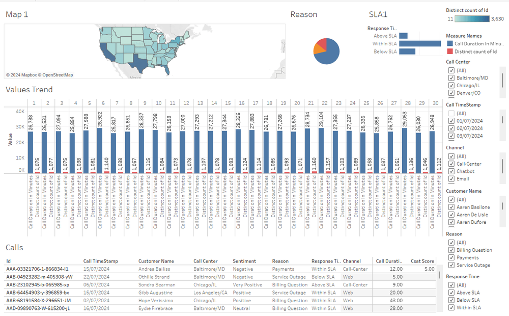
During the presentation I applied the logic we've discussed to a typical business dashboard I have seen many various of whilst working with clients:
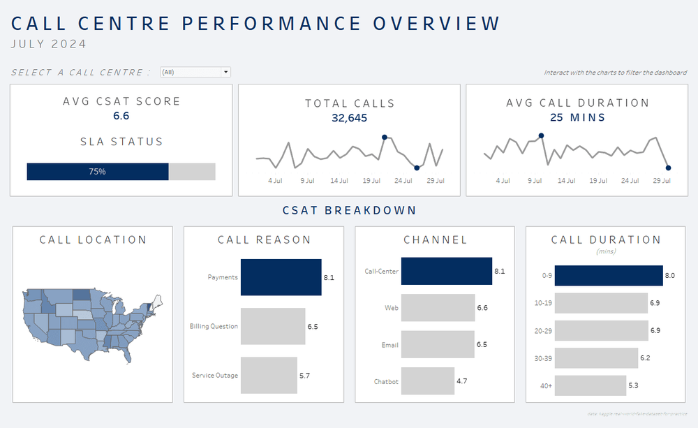
After applying the key concepts we've discussed we now have a dashboard which can clearly be used to aid the decision-making process. The dashboard is now easy to pull insights from and it really clearly answers a business question of 'how can we improve our customer satisfaction scores'.
I hope this blog was helpful and that you'll be able to implement the three key steps into your next dashboarding project!