

23 January 2014
At The Information Lab we like a challenge and so, when we saw this visualisation last week, we wanted to try something similar as a Tableau visualisation, using arrows to show the migration flows. Certainly this would be hard enough, but we also wanted to make it accessible; so no tough mathematics, no complex table calculations and no coding at all. Could it be done? Well to test him out we gave the problem to one of our newest recruits Chris Love to see what he'd make of it.Let's start with final dashboard to let you judge the result for yourself and then we'll let Chris guide you through how he built it and how you can build similar visualisations quickly and easily.[tableau server='public.tableausoftware.com' workbook='USMigrationFlows2012' view='Dashboard' tabs='yes' toolbar='no' revert='all' refresh='yes' linktarget='' width='560px' height='810px'][/tableau]If you looked at the second dashboard then I hear you shouting 'You cheated! You used a separate application to generate the data'. Well sorry folks, but that's how us new guys make a name for ourselves - by building things even the most advanced users would find difficult. So yes, to generate the data I used Alteryx - a data manipulation tool that specialises in data manipulation and geospatial analysis (as well as predictive analytics) - but I assure you all it required was some straightforward data manipulation and a little bit of an imagination for problem solving - as promised there were no complex calculations and no hard maths.Let's start by looking at the problem of generating the arrows themselves, how can we solve this? My Alteryx experience told me that all I needed was a set of points for each arrow and then I could use the Alteryx Build Polygon Tool to generate the shapes as polygons (Adam Riley at Alteryx recently independently used this technique to draw gauges in Alteryx reports). If you remember doing dot-to-dots as a child then this will be familiar to you, all we need to do is generate the dots, in order, and Alteryx will help us to do the rest. I put my thinking cap on and came up with the following 'maths-free' approach.
I'm using some other tools too, such as Sort and Sample to collect the point nearest to the one I need, but those above are the main tools.Alteryx also allows me to then encapsulate this logic into a single 'macro' to reuse in other modules, and we can expose simple parameters to allow us to control the functionality of the underlying tools dynamically. I've done this in order to embed the logic in a larger module to transform the migration data into Tableau. You can download the full packaged module here and take a look at how it works in Alteryx (download a trial if you haven't already).I've also created a public 'app' in the Alteryx Gallery using my Arrow Generation module. Apps are simple to set up via Alteryx and can be instantly published to the Gallery via one button click. The result? Anyone can now generate their own arrows for tableau, in tde format, using a free, public application. Visit the app* here and register for the gallery to try it out, no software install necessary, and watch the three minute video below to see how easy this is for any to produce stunning visualisations in Tableau using this app - and make sure you let us know what you think.*Please note the app is not necessarily production ready, and hasn't been tested thoroughly to catch all errors - it is intended as a demonstration of what is possible.
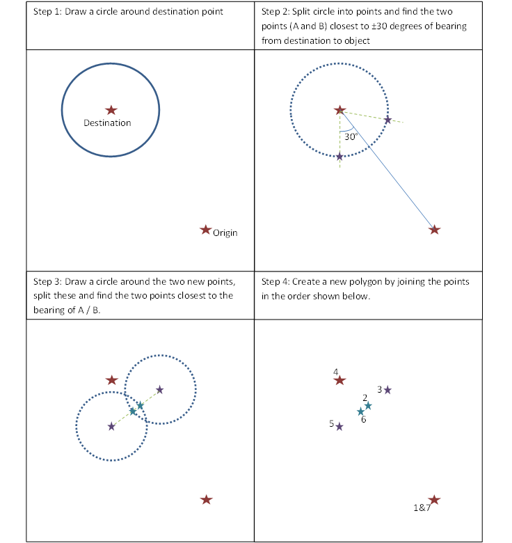
 Create Point Create Point | Typical usage: Create spatial points in the data stream using numeric coordinate fields.How I'm using it: I'm converting the States central latitude and longitude into spatial points. |
| Typical usage: Define radii (including non-overlapping) or drive-time polygons around specified points.How I'm using it: To create the circles in Steps 1 and 3 |
| Typical usage: Split a polygon or polyline into its component polygons, lines, or points.How I'm using it: Breaking the circle into a series of points in Steps 2 and 3. |
| Typical usage: Combine two data streams based on common fields (or record position). In the joined output, each row will contain the data from both inputs.How I'm using it: Joining the split points from the circle to the main point to pass into the distance tool. |
| Typical usage: Calculate the distance or drivetime between a point and another point, line, or polygon.How I'm using it: The distance tool allows returns the bearing of objects, so I can use it to find the points on the circle in step 2 |
| Typical usage: Create or update fields using one or more expressions to perform a broad variety of calculations and/or operations.How I'm using it: To create some custom fields to help me with some quick calculations on the way, e.g. ensuring no negative angles. |
| Typical usage: Create a polygon or polyline from sets of points.How I'm using it: To build the final arrow polygon from the series of ordered points |


