

13 April 2016
Most of the time, when we build a Tableau dashboard is with at least one of these two objectives in mind: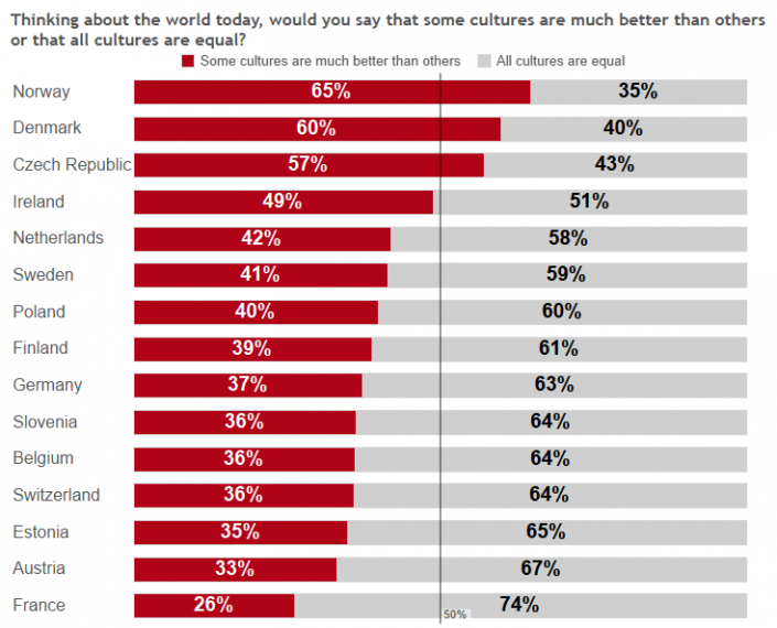 Norway, Denmark and Czech Republic are the ones with higher percentage of people that agrees with the idea that some cultures are much better than others, concretely more than the 55% in the three of them, while Austria and specially France the percentage is around 30%. In these countries most people agrees that all cultures are equal.If we add Gender to filters we'll be able to visualize the same data for men and women, but the users will need to look for their own conclusions and maybe missing insights that we want to emphasize. We could also had a text box with the global conclusion and also the gender comments even if the user doesn't visualize the data by gender, mixing the global conclusion and maybe loosing impact in both messages or overwhelming the user with too much information at the same time. How could we show different comments based on the gender selection?To do so, I'm going to use this tip from Andy Kriebel to have multi level filters using a parameter, and then create a calculated field with the different insights we want to emphasize. The reason to use Andy's tip and a parameter instead of a regular filter is to make it work correctly when the user select the 'All' option (both men and women). These are the steps to follow:1. Create the parameter with our 3 options: All, Men and Women, and show the parameter control.
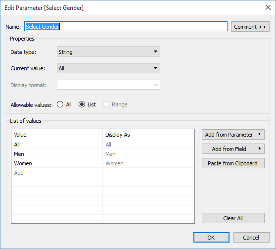 2. Create a calculated field that filters the view based on the parameter selection. Drop the calculated field in Filters and select only True. In out case, basically if the parameter equals a value of our Gender dimension, it will filter the data to the concrete gender. If we select All, it will show all the data without filtering by anything (see the image).
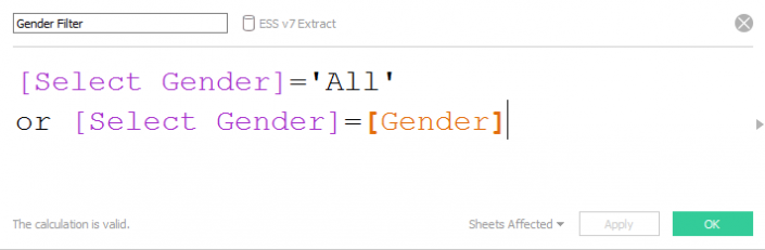 3. Now we have to create the different comments for each option of the parameter. So we create a calculated field, D25 comments like this:
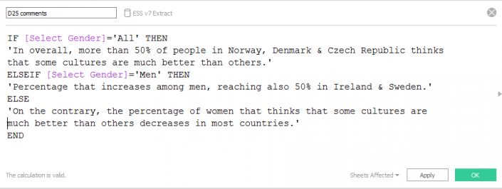 4. In a different sheet, we just need to change the mark type to text and drop the new calculated field to the text shelf in the marks card.Now we only have to put both sheets in a dashboard and make sure that we include the parameter. We can also edit the comments sheet to emphasize it as an information we should pay attention to. Click on the image to view the visualization:
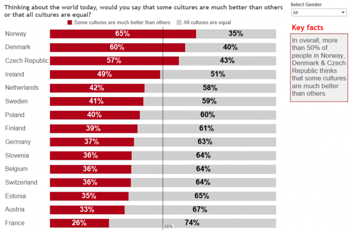 Now we are not only allowing the user to select the data he wants to visualize, but also we are making sure that he keeps in mind the conclusions that we want to emphasize as analysts.
- Monitor performance: Tracking our sales, service, profit, etc. to make sure everything is within limits and, if not, be aware of what's going wrong as fast as possible.
- Insight discovery: Have several filters, actions and parameters that allows the users to interact with the dashboard and discover insights by themselves.
- No actions, filters or parameters. The data is 'static' and we drive the audience with few visualizations per dashboard / story point and text boxes and annotations with out findings.
- Include actions, filters or parameters and instructions telling the users how to use them, but then loosing the annotations and comments, as these are not dynamic and we don't want to confuse the users with comments that doesn't match the data visualized.
Thinking about the world today, would you say that some cultures are much better than others or that all cultures are equal?After preparing the data using Alteryx, if we have a look at the percentage by country this is what we see:
Norway, Denmark and Czech Republic are the ones with higher percentage of people that agrees with the idea that some cultures are much better than others, concretely more than the 55% in the three of them, while Austria and specially France the percentage is around 30%. In these countries most people agrees that all cultures are equal.If we add Gender to filters we'll be able to visualize the same data for men and women, but the users will need to look for their own conclusions and maybe missing insights that we want to emphasize. We could also had a text box with the global conclusion and also the gender comments even if the user doesn't visualize the data by gender, mixing the global conclusion and maybe loosing impact in both messages or overwhelming the user with too much information at the same time. How could we show different comments based on the gender selection?To do so, I'm going to use this tip from Andy Kriebel to have multi level filters using a parameter, and then create a calculated field with the different insights we want to emphasize. The reason to use Andy's tip and a parameter instead of a regular filter is to make it work correctly when the user select the 'All' option (both men and women). These are the steps to follow:1. Create the parameter with our 3 options: All, Men and Women, and show the parameter control.2. Create a calculated field that filters the view based on the parameter selection. Drop the calculated field in Filters and select only True. In out case, basically if the parameter equals a value of our Gender dimension, it will filter the data to the concrete gender. If we select All, it will show all the data without filtering by anything (see the image).3. Now we have to create the different comments for each option of the parameter. So we create a calculated field, D25 comments like this:4. In a different sheet, we just need to change the mark type to text and drop the new calculated field to the text shelf in the marks card.Now we only have to put both sheets in a dashboard and make sure that we include the parameter. We can also edit the comments sheet to emphasize it as an information we should pay attention to. Click on the image to view the visualization:Now we are not only allowing the user to select the data he wants to visualize, but also we are making sure that he keeps in mind the conclusions that we want to emphasize as analysts.