

Ever wondered how many vizzes are on Tableau Public? How about enough to send you one every single day! Tableau have just redesigned the Public portal around the notion of delivering a viz to you each day. This is not just a great way to keep up with what everybody’s doing but also to improve your Tableau skills. If you want to learn ‘just how did they do that’ or simply be inspired by what’s possible, signup and download the workbooks which catch your eye.
Ross Perez of Tableau Software recently filled me in on what it’s all about.
If you have ever found yourself ogling an infographic or interactive visualization, you may want to take a look at Tableau Public’s Viz of the Day. The concept is simple: subscribe to the feed, Twitter or e-mail and every day you will receive one beautiful interactive visualization in your inbox.
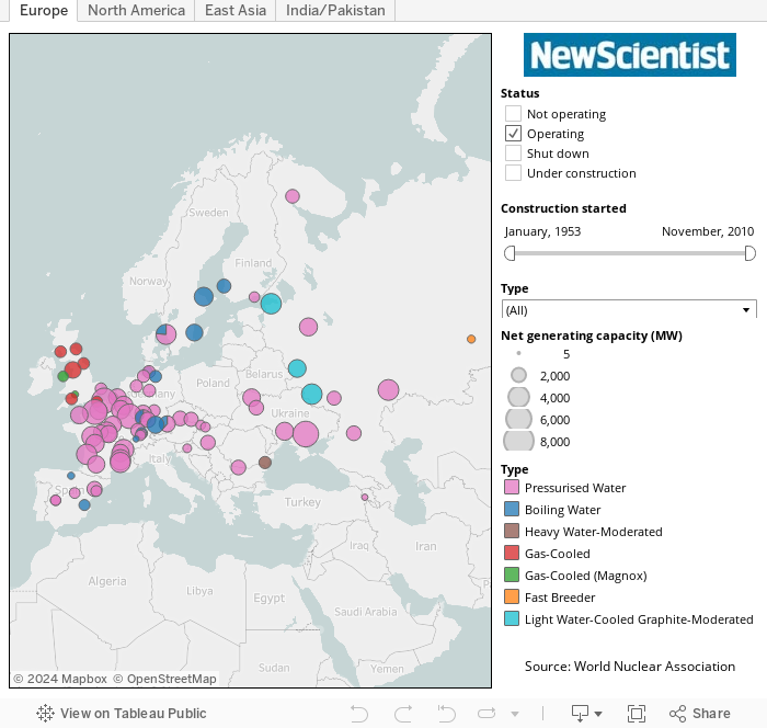
Tableau Public is a free tool that allows anyone to create and publish an interactive visualization to the web with their own data. Each day, bloggers, journalists and data enthusiasts from Australia to Alameda to Argentina create hundreds of visualizations using the program. Viz of the Day visualizations are chosen from among the very best of these Tableau Public creations, like the view below which shows the location of nuclear power plants worldwide.
If you are interested you can sign up on the Viz of the Day website, or just go straight to the e-mail subscription.