

23 July 2015
It is easy to represent where a project starts or where it ends using Tableau's Gantt chart. However, when we want to look at the duration of a project it can be quite difficult to create the visualisation.For example, imagine you are creating a timetable for lessons. There will be multiple different lessons within a day, so there will be multiple start times and end times for each lesson.You may be familiar with the DATEDIFF function which calculates the difference, at a given time level, between two time periods.E.g. DATEDIFF('minute',[Start],[Finish])If we use this calculation to work out the difference between the start and end of a lesson we should then be able to use this as the size of the Gantt bar. This should show the length of each lesson as a bar, however it’s often at this point things don’t look as they should:What we want: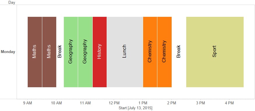 What we see:
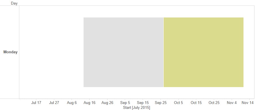 Not what we want. What you may notice in this image is that the date range along the bottom spreads from Jul 17 to Nov 14. This is an indication of what may be going wrong here. If you look at the tooltip here you’ll notice that the datediff calculation shows quite a large number. The size of the bars are actually the size in days, therefore these numbers are too large.As the datediff calculation is in minutes, what you’ll need to do is divide the datediff by (24*60) to make the size of the bars measurable to the day. (If the calculation is in seconds you’ll need to divide it by 24*60*60)Now what we see is:
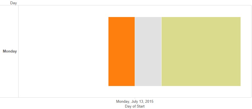 Still not quite there. The issue here is that the 'Start' is at the wrong level of time detail. I added the Start Time to the columns shelf and chose the continuous ‘day’ level. What is actually required is the ‘exact date’, this will then give you the desired result.
What we see:Not what we want. What you may notice in this image is that the date range along the bottom spreads from Jul 17 to Nov 14. This is an indication of what may be going wrong here. If you look at the tooltip here you’ll notice that the datediff calculation shows quite a large number. The size of the bars are actually the size in days, therefore these numbers are too large.As the datediff calculation is in minutes, what you’ll need to do is divide the datediff by (24*60) to make the size of the bars measurable to the day. (If the calculation is in seconds you’ll need to divide it by 24*60*60)Now what we see is:Still not quite there. The issue here is that the 'Start' is at the wrong level of time detail. I added the Start Time to the columns shelf and chose the continuous ‘day’ level. What is actually required is the ‘exact date’, this will then give you the desired result.