

24 April 2016
 Over the past few weeks, I've been working on my submission for the 2016 Iron Viz competition and let me say, this was PRESSURE! Note to self for future Iron Viz work: do not browse other peoples’ submissions on Twitter, it will just FREAK. YOU. OUT. Everyone’s been amazing, and whether I get accepted or not it was a great learning processes and I'm sure this year’s Iron Viz is going to be edge-of-your-seat incredible.The first thing I did was locate my data, and let me tell you this took 90% of my time. I spent the first few days trying to figure out what I wanted to look at, and even though I had all these awesome food-themed ideas, the data just didn't exist or was incomplete or just not workable with Tableau. I ended up settling on the UK Family Food Dataset . I used to volunteer in a food service non-profit when I was living in Vancouver, and there were a lot of myths people held about what foods low income individuals were drawn to, how their diets were shaped, and what role alcohol played in their lives. I decided to explore some of these ideas and see how things manifest here in the UK.My next step was to clean the data using Alteryx in order to pull data from all income levels together, remove nulls, and just generally make things workable in Tableau. Once that was done, I imported my data into Tableau and started exploring. Although the dataset divided income levels into deciles, I decided to define high income as the top 20% of the population (decile 9 and 10) and low income as the bottom 20% (decile 1 and 2).The first myth I wanted to address was the idea that low income people are more likely to purchase takeaway foods because they’re cheap and quick. However, for both low income and high income individuals, takeaway foods only make up 1% of all household purchases. I originally had this highlighted as a bar chart, but because of the amount of space it took up, I settled for the more compact pie chart. I know, pie charts are the bane of data analysts’ existence, but in this case I think it works because I'm only looking at two groupings of data (takeaway food vs. other). If nothing else it is a food themed competition so… pie charts.
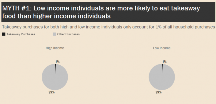 I then looked at nutrition and was surprised to see that low income individuals’ nutrition was actually quite comparable to high income individuals. The only nutrient that seems to be a problem is vitamin A. A quick Google search showed that this is a common issue in developing nations and is usually attributed to a dietary lack of animal sources of vitamin A, as well as increased alcohol consumption. However, deficiency is rare in developed countries like the UK, so it doesn't appear to be affecting people in a way that is concerning.
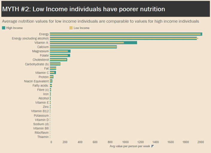 I also wanted to show fruit and vegetable consumption as a percentage of total household purchases, but ended up with some bumps in my table calculation. I originally wanted to show this as a unit chart pyramid, kind of like the plate on the left in this infographic:
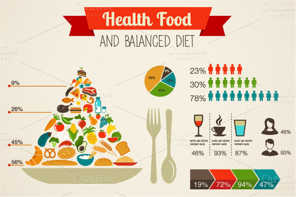 I’m pretty sure my table calculations were getting messy because of the header-subheader format of the data set, so I settled on the icons with text to add some images to my viz and used another pie chart to demonstrate fruit/veg consumption as a percent of total.
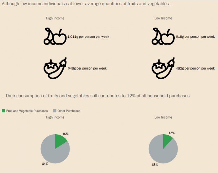 My last chart explores alcohol consumption, which is a pretty big stereotype I’ve come across about low income people. Alcohol abuse is definitely something that affects low income communities, but the stigma associated with it leads people to believe they are the only communities affected by alcoholism. The data in this case isn’t reflective of alcoholism per se, but it shows measured quantities of alcohol purchases per person per week. I was surprised to see that not only do high income individuals consume more alcohol, they consume pretty much double the amount. Wine and Champagne are also their greatest expenses, compared to milk and cream products for low income individuals.
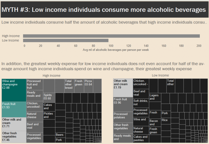 This dataset was not easy to work with, but overall, I'm happy with what I was able to produce. I wanted to work with something I was passionate about, and when the food theme came up it reminded me about all these discussions I've explored about food security, right to food, and food accessibility. It was interesting to see how things are developing here in the UK, and I gained some insight about not only the quantity of food people are consuming, but also the quality and how this is affected by income levels.