

27 July 2017
I was recently working on client site at a university, transforming their Key Performance Indicator (KPI) reporting suite. This type of report looks at how individual KPIs perform over time and compare against other institutions. There are 135 higher education providers in the UK1 so it’s difficult to compare against the whole group, but we can narrow down the list to some of the better-performing universities in order to see their performance and prioritise areas where they can easily make changes.The client request was to visualise the biggest improvers in the last year, two years or three years. Let’s see how we can achieve that with some different, publicly-available data from Public Health England (PHE) Screenings. To give a bit of medical context, the screenings are performed by National Health Service (NHS) wards to identify healthy individuals at risk of disease or medical condition, and PHE gather data as quality assurance of screening programmes. You can download the data here.These are the maternity services in the UK which showed the biggest improvements in their performance during the last financial year 2016 to 2017.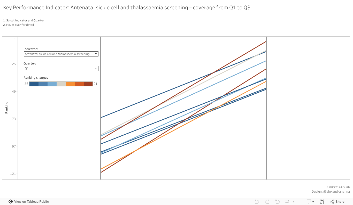 Below are the steps you can take to build your own viz.Step 1: Split the data into separate measures for each time period.
 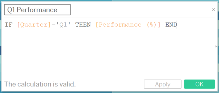 Step 2: Add comparators (Maternity Ward) onto Detail, Measure Names and Measure Values on to Columns and Rows, respectively. Leaving only the measures created above (Q1 and Q3 Performance) remove all green pills from the Measure Values container .Step 3: Add ranks to both measures using Table Calculations and compute using Maternity Ward.Step 4: Create the rank difference calculation by dragging your green pills into a new calculated field.
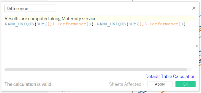 Step 6: Rank the difference from biggest values to the smallest.
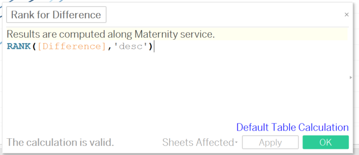 Step 7: Create the following filter linking to the previous calculation, pop it into the filter shelf (selecting true)
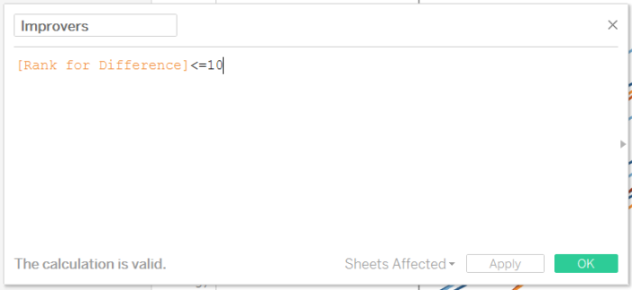 Step 8: Finally, to toggle between the quarters create a ‘Select quarter' parameter and a calculation to link back to the visualisation
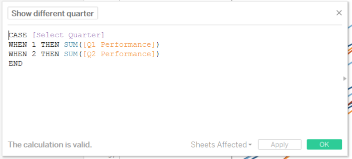 Step 9: Replace Q1 performance from the measure values container, apply the ranking and don’t forget to replace the calculation within the difference calculationNow the chart is drawn we can seek some insights, let’s look at the #1 improver: Mid Essex Hospital Services NHS leaped from 120th into the top 30. Toggling from Q1 to Q2 we can see this only happened recently. Perhaps it would be better to identify wards that are continually getting better every quarter, I invite you to explore the visualisation and find them.
Below are the steps you can take to build your own viz.Step 1: Split the data into separate measures for each time period. Step 2: Add comparators (Maternity Ward) onto Detail, Measure Names and Measure Values on to Columns and Rows, respectively. Leaving only the measures created above (Q1 and Q3 Performance) remove all green pills from the Measure Values container .Step 3: Add ranks to both measures using Table Calculations and compute using Maternity Ward.Step 4: Create the rank difference calculation by dragging your green pills into a new calculated field.Step 6: Rank the difference from biggest values to the smallest.Step 8: Finally, to toggle between the quarters create a ‘Select quarter' parameter and a calculation to link back to the visualisationStep 9: Replace Q1 performance from the measure values container, apply the ranking and don’t forget to replace the calculation within the difference calculationNow the chart is drawn we can seek some insights, let’s look at the #1 improver: Mid Essex Hospital Services NHS leaped from 120th into the top 30. Toggling from Q1 to Q2 we can see this only happened recently. Perhaps it would be better to identify wards that are continually getting better every quarter, I invite you to explore the visualisation and find them.