

23 May 2017
As we all know, there are many different ways to filter a dashboard in Tableau - parameters, quick filters, highlighting points and selecting 'Keep Only' or 'Exclude' etc. With the usual filters, it's so easy to apply them to different sheets so that it updates your whole dashboard simultaneously, but how do you apply a 'Keep Only' or 'Exclude' filter to different sheets simultaneously?This was exactly the question I had to answer at my placement recently. If we have multiple sheets on the same dashboard, all built from the same data set, why don't all sheets get filtered when you select a group of points to remove or keep?Take this dashboard (using Superstore data) for example -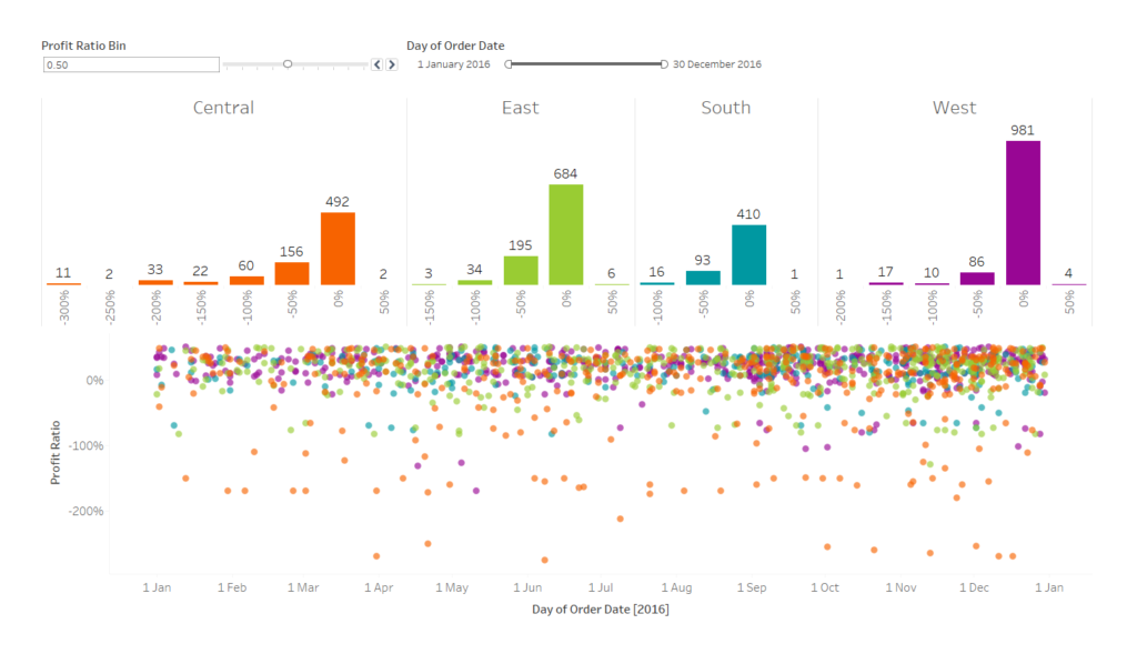 Here we're looking at the distribution of profit ratio across the different regions over the whole of 2016, broken down by Order ID. Say we want to only look at the orders which have a positive profit ratio; the most accurate way to do this would be to select and keep only the relevant bars in the distributions, and use that data to update the time series plot. However, even though both sheets were made from the same data, it doesn't work like this - the scatter plot does not get filtered, as we can see in the video below:[video width='1456' height='830' mp4='https://www.theinformationlab.co.uk/wp-content/uploads/2017/05/Before-filter-video.mp4'][/video]After selecting the bars we want to keep, if we go back on to the distribution worksheet, we can see that there is a new object in our Filters shelf. We can see from the icon on the right of this new object (inside the red square) that this filter is based on a set. This set is automatically created by Tableau, and is based on whatever dimensions and measures are in the view that we used to filter the data. We want to use this filter and apply it to the time series.
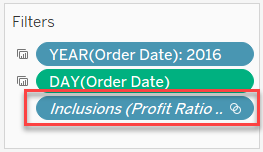 Before we do this, we need to bring back all the data that we got rid of so both the distribution and the time series sheets are showing the same data. Right click on the new filter object, select 'Edit Filter...', and then choose the 'Use all' option to include all data. The distributions should now be showing all of the original bars.We now want to apply this filter to our time series. Again, right click on the filter object, but this time choose 'Apply to Worksheets' > 'Selected Worksheets'. The worksheet that you created the filter on will be greyed out, just select the other worksheets you want this 'Keep Only' filter to apply to. Now, when we select some bars to keep, the time series will now show only the corresponding points.
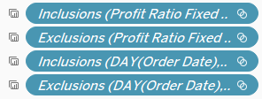 The symbol on the left of each filter object indicates that it is being applied to multiple sheets. Now, when we use the bar chart to show only the positive profit ratio orders, it simultaneously filters the time series too:[video width='1456' height='838' mp4='https://www.theinformationlab.co.uk/wp-content/uploads/2017/05/After-filter-video.mp4'][/video]We can also use the time series to filter the distribution bars:[video width='1558' height='956' mp4='https://www.theinformationlab.co.uk/wp-content/uploads/2017/05/After-filter-from-time-series.mp4'][/video]And there we have it, the 'Keep Only' and 'Exclude' filters work across the whole dashboard. Download this example workbook here.
Here we're looking at the distribution of profit ratio across the different regions over the whole of 2016, broken down by Order ID. Say we want to only look at the orders which have a positive profit ratio; the most accurate way to do this would be to select and keep only the relevant bars in the distributions, and use that data to update the time series plot. However, even though both sheets were made from the same data, it doesn't work like this - the scatter plot does not get filtered, as we can see in the video below:[video width='1456' height='830' mp4='https://www.theinformationlab.co.uk/wp-content/uploads/2017/05/Before-filter-video.mp4'][/video]After selecting the bars we want to keep, if we go back on to the distribution worksheet, we can see that there is a new object in our Filters shelf. We can see from the icon on the right of this new object (inside the red square) that this filter is based on a set. This set is automatically created by Tableau, and is based on whatever dimensions and measures are in the view that we used to filter the data. We want to use this filter and apply it to the time series.Before we do this, we need to bring back all the data that we got rid of so both the distribution and the time series sheets are showing the same data. Right click on the new filter object, select 'Edit Filter...', and then choose the 'Use all' option to include all data. The distributions should now be showing all of the original bars.We now want to apply this filter to our time series. Again, right click on the filter object, but this time choose 'Apply to Worksheets' > 'Selected Worksheets'. The worksheet that you created the filter on will be greyed out, just select the other worksheets you want this 'Keep Only' filter to apply to. Now, when we select some bars to keep, the time series will now show only the corresponding points.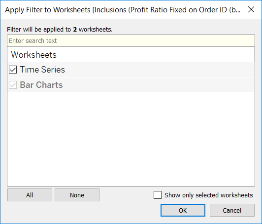
The symbol on the left of each filter object indicates that it is being applied to multiple sheets. Now, when we use the bar chart to show only the positive profit ratio orders, it simultaneously filters the time series too:[video width='1456' height='838' mp4='https://www.theinformationlab.co.uk/wp-content/uploads/2017/05/After-filter-video.mp4'][/video]We can also use the time series to filter the distribution bars:[video width='1558' height='956' mp4='https://www.theinformationlab.co.uk/wp-content/uploads/2017/05/After-filter-from-time-series.mp4'][/video]And there we have it, the 'Keep Only' and 'Exclude' filters work across the whole dashboard. Download this example workbook here.