

15 October 2014
Multiple response survey data got you in a fix? Transform it into great analysis with Alteryx and Tableau in the first part of a series on the subject.
Survey data is an increasingly popular type of data source that can pose a few dilemmas when analysing. Prior to joining The Information Lab I worked exclusively with survey data and spent a lot of hours finding new and informative ways to visualise responses in Tableau (there's only so many bar charts you can look at, right?).I have been asked on a few separate occasions recently about how to visualise multiple response survey data in Tableau. I thought I would compose a series of blog posts on how to deal with structuring the data, as well as great ways to visualise it using Tableau.This first part is going to deal mainly with the basics: getting a good data structure; and the most basic way of analysing a multiple response question.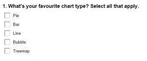 There are several ways of analysing this type of question. I'm going to focus this blog post on the easiest, but most efficient way: frequency analysis.
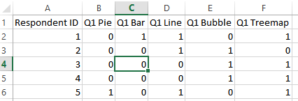 This is typical of what you might get when you export a multiple response question from your survey software. You usually see a row per respondent and a column per answer option. A '1' denotes that the respondent has ticked this response. Where a '0' is a no answer (null). This type of structure actually makes it pretty difficult to analyse. Rather than a 'wide' format, we would be better off creating a 'tall' format. This creates multiple rows per respondent per answer option.
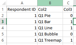 So how do we do this? There are a multitude of options but I'm going to show you how to do this two ways; Alteryx, and the Tableau Excel Add-In.
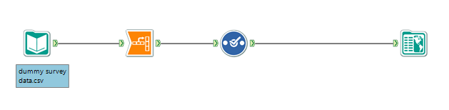 Alteryx allows you to easily transform your survey data. It can also allow you to do some great data clean-up often required with survey data - renaming fields, changing labels for answer options, and more. What's even better is that, once you have built your module, when you get a new batch of survey data through you can just run it through the same module again.In the above module I have used an Input tool to select my .csv file of survey responses. Then I have used the Transform tool to reshape my data.
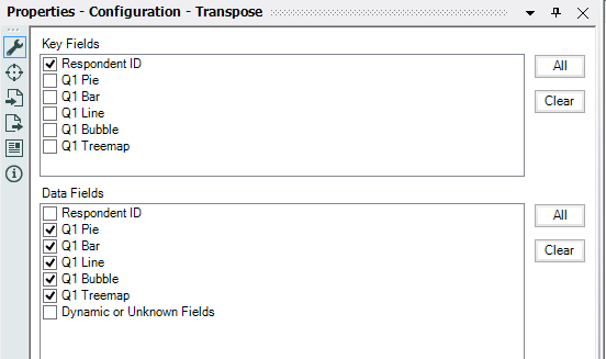 For your Key Fields always select 'Respondent' or your unique respondent identifier (email address, name etc.). You can also choose any demographic questions like age, gender, location as your key fields. This will then transform the data around those fields.The data fields are the multiple response answer options.Next I have used a Select Tool to rename the generated columns 'Name' and 'Value' to 'Question' and 'Response'. I have also changed the data type on the Response to an integer as I want this to appear as such in Tableau.
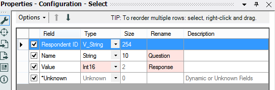 Then just connect an Output tool to the end - I've chosen to go straight to a Tableau .tde file, but you could output to a database or flat file like .csv if you wished.Here's a video of the whole process in action (1min 24 and no sound - office friendly!).[embed]http://youtu.be/WaxJmV_b1-k[/embed]
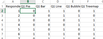 As you can see I have chosen the first multiple response answer - this means the data will be reshaped around my key field (respondent id). Then select the Tableau menu and choose the Reshape data button. In the menu box that appears make sure the cell you selected is in the box and then press OK.
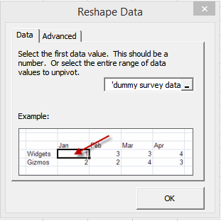 Here's what the data now looks like:I renamed Col2 to Question and Col3 to Response so it will be easy to identify in Tableau. Then save your file and you're good to go!
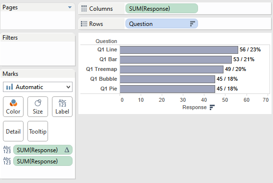 Here's a handy video of how to create the finished result:[embed]http://youtu.be/GpeZKa5RtD8[/embed]I have used a table calculation to create the percentage label. This is a useful piece of analysis to show as well as the count of responses as it gives some perspective.Finally you can download the Alteryx Module and the Tableau Workbook.
What is a multiple response question?
A multiple response question typically lets a respondent choose multiple answer options in one question. For example:There are several ways of analysing this type of question. I'm going to focus this blog post on the easiest, but most efficient way: frequency analysis.Frequency Analysis
This is simply the count of responses per answer option. The responses are then ranked in order of importance, the most picked option being first. This type of analysis is simple, easy to understand and interpret. One downfall of this type of analysis is that it ignores the combination of people's responses - but we'll deal with that in a second post.Let's take a look at the data:This is typical of what you might get when you export a multiple response question from your survey software. You usually see a row per respondent and a column per answer option. A '1' denotes that the respondent has ticked this response. Where a '0' is a no answer (null). This type of structure actually makes it pretty difficult to analyse. Rather than a 'wide' format, we would be better off creating a 'tall' format. This creates multiple rows per respondent per answer option.So how do we do this? There are a multitude of options but I'm going to show you how to do this two ways; Alteryx, and the Tableau Excel Add-In.Restructuring the data with Alteryx:
Alteryx allows you to easily transform your survey data. It can also allow you to do some great data clean-up often required with survey data - renaming fields, changing labels for answer options, and more. What's even better is that, once you have built your module, when you get a new batch of survey data through you can just run it through the same module again.In the above module I have used an Input tool to select my .csv file of survey responses. Then I have used the Transform tool to reshape my data.For your Key Fields always select 'Respondent' or your unique respondent identifier (email address, name etc.). You can also choose any demographic questions like age, gender, location as your key fields. This will then transform the data around those fields.The data fields are the multiple response answer options.Next I have used a Select Tool to rename the generated columns 'Name' and 'Value' to 'Question' and 'Response'. I have also changed the data type on the Response to an integer as I want this to appear as such in Tableau.Then just connect an Output tool to the end - I've chosen to go straight to a Tableau .tde file, but you could output to a database or flat file like .csv if you wished.Here's a video of the whole process in action (1min 24 and no sound - office friendly!).[embed]http://youtu.be/WaxJmV_b1-k[/embed]Restructuring the Data with the Tableau Add-In for Excel:
Firstly you will need to download the add-in if you don't already have it.Open up your survey data and select the cell where your first data point is:As you can see I have chosen the first multiple response answer - this means the data will be reshaped around my key field (respondent id). Then select the Tableau menu and choose the Reshape data button. In the menu box that appears make sure the cell you selected is in the box and then press OK.Here's what the data now looks like:I renamed Col2 to Question and Col3 to Response so it will be easy to identify in Tableau. Then save your file and you're good to go!Anaylsing in Tableau
Open up Tableau Desktop and connect up to your transformed data source. (Pro tip - don't be afraid to connect up to both the original 'wide' format and your new 'tall' format in Tableau! This gives you a good choice of what you can create for your analysis).Here's a handy video of how to create the finished result:[embed]http://youtu.be/GpeZKa5RtD8[/embed]I have used a table calculation to create the percentage label. This is a useful piece of analysis to show as well as the count of responses as it gives some perspective.Finally you can download the Alteryx Module and the Tableau Workbook.