


My latest visualisation, London Neighbourhoods, included some unique features I've not seen used in visualisations in Tableau before. These are possible due to some of the features in Tableau 2019.2: Parameter Actions and Hidden Containers. I talk you through how to achieve a similar effect in this post.
About the Effect
The end result we're looking for is a guided tutorial with buttons to step forwards and backward. The tutorial itself affects the visualisation, drawing annotations and changing aspects of the view in order to show the user what they can do.
The effect is rather like 'story points' but without the use of boxes in the view.
Once the viewer is finished with the prescribed 'story' / tutorial they are free to then explore the visualisation on their own terms after hiding the container.
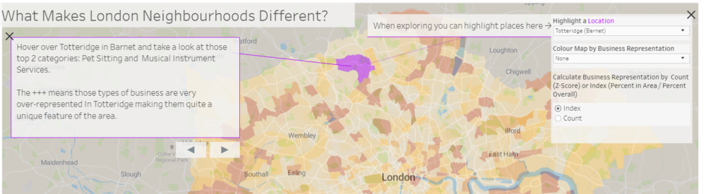
Before you continue I'd recommend going through the tutorial and seeing what it does: London Neighbourhoods. Also, download the workbook and use it to follow along.
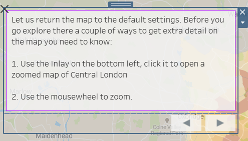
What You'll Need
- A viz you need to add the tutorial to
- An Excel Sheet with your text details for each 'story point' in it
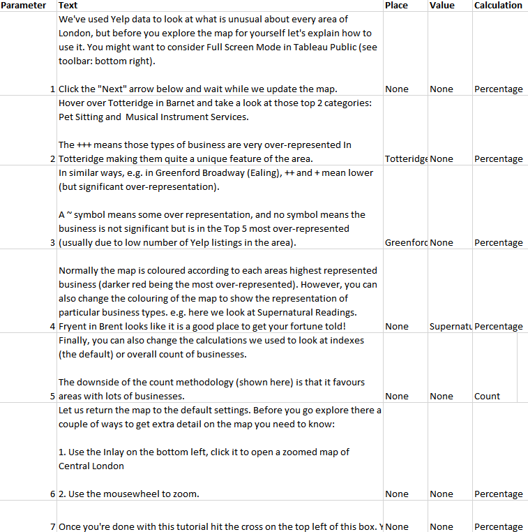
As you can see my story points above included a few things. Firstly an order in the parameter column, secondly the text. Thirdly the values of some parameters I wanted to use to control my visualisation during the tutorial, in columns 3-5.
Set-up
To set up the tutorial text I created 3 sheets:
- Text: This was a sheet that contained the Text field from my Excel sheet. I created a [Control Parameter] with numbers 1 to 7 and filtered the sheet to show the number text based on the parameter selected. (Download the workbook from Tableau Public and look at the Text sheet to see details).
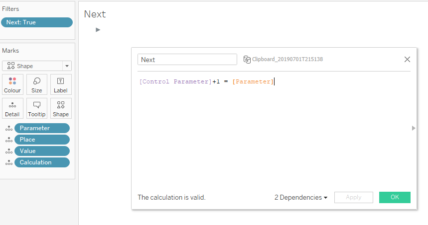
- Next: This sheet simply shows the next parameter value as a Shape (an arrow). I use the calculation below to show the next value (adding one to the current parameter value). e.g. if parameter 1 is set, this mark will be filtered to show 2.
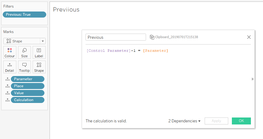
- Previous: This sheet simply shows the previous parameter value as a Shape (an arrow). I use the calculation below to show the previous value (subtracting one from the current parameter value). e.g. if parameter 2 is set, this mark will be filtered to show 1.
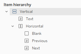
I then dragged them the ext into a Vertical Container, before using a Horizontal Container and Blanks to set up the arrows as I wanted (sizing accordingly).
At this point you can tweak the parameter manually and watch the text change. A nice feature is that the arrows disappear if there is no data, e.g. when Previous is looking for a 0, or Next is looking for an 8. These values aren't in the Excel data and so don't exist.
Parameter Action Set-up
Next we need to set-up our parameter actions in 2019.2
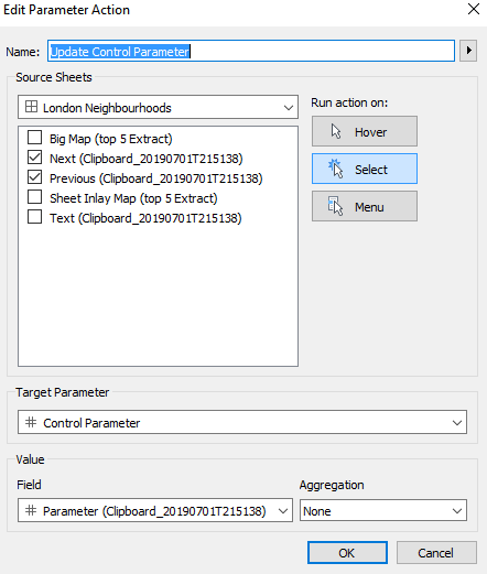
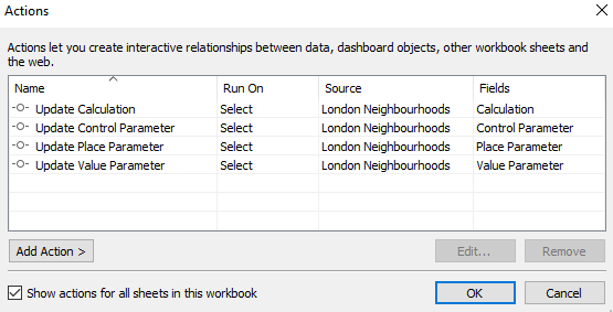
To do this I went to Dashboard > Actions and Created a new Parameter Action. The settings are shown above - basically I am asking Tableau to take the value from the Next / Previous sheets if they are clicked and update the Control Parameter - using the value of the Parameter shown in the workbook i.e. this will add one to the Control Parameter if I click on Next, and subtract one if I click on Previous.
In a similar way, I also update the values of the other parameters I want to control using the tutorial (remember these are also set in the Excel sheet)- this gives the user the experience of changing the settings and seeing what happens.
Finishing Touches
Now the viz wouldn't be complete without some dynamic annotations to show the user what is updating in the Viz and help them find the settings. I have carefully placed these to guide the user as they click through the tutorial. But how did I do so?
My inspiration came from Josh Milligan and his posts on Dynamic Annotations: https://vizpainter.com/dynamic-annotations-part-3/
Sadly due to some changes in the way Tableau works under the hood the way a mark is defined in Tableau is no longer a simple as Josh explains in his excellent post. This is because of some underlying required for Set and Parameter Actions in 2019.1.
However that doesn't mean we can't still hack this in a similar way, we just need to expand on what Josh found.
Josh's method relies on creating a simple calculation referencing the parameter and adding that to the view. That, in turn, changes the definition of a 'mark' in the view as the parameter changes - thus allowing different annotations to be shown. This method doesn't work post 2019.1 because a mark no longer changes based solely on a parameter change.
Our new method (Jedi level hack alert) is to create a calculated field to trick Tableau into seeing the Mark as a new one when the parameter changes. Here's the calculation:
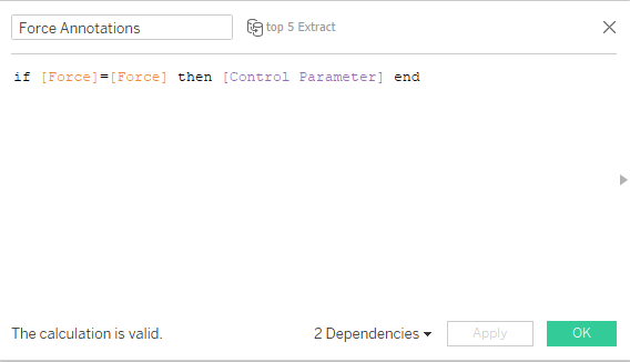
The 'Force' field is any old field I'm not using in my view. The IF statement will always evaluate to true and return the Parameter. However, this mark will be re-evaluated every time I change my parameter due to the IF statement and so we can use this calculation instead of Josh's original.
The workflow then becomes:
- Create the calculation
- Add it to the view
- Add annotations for the current parameter
- Change Parameter and repeat step 3.
The annotations will stay hidden until the correct parameter is chosen.
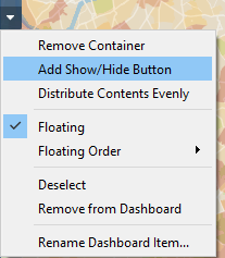
Hiding the Tutorial
Creating the button to hide the tutorial elements was simple, on a floating container select the option below:
I used this in several areas of the visualisation, changing the icon for inlay map to a screenshot of itself to create the effect of popping out the inlay.
Conclusion
Parameter Actions allow unprecedented control over the UX in Tableau, allowing for some cool techniques. I've applied this to a fun dashboard, but it could easily be applied to a business dashboard, giving a great way of introducing users to the dashboard.