If you're part of the Tableau community, chances are you've heard of Tableau Next by now. After hearing all the buzz surrounding this new addition to the Tableau Family, I wanted to get hands-on and see what it's really like to use as a BI tool. Below are some of my initial thoughts and reflections on using Tableau Next to create a dashboard. Note that the features and limitations mentioned are simply those that stood out to me - not a comprehensive list.
What is Tableau Next?
Tableau Next is a version of Tableau built on the Salesforce platform, featuring a unified data layer and AI-powered semantic modelling, allowing data to be easily translated into business-friendly insights. Integrating Salesforce with Agentforce, Tableau Next offers an end-to-end, workflow-driven approach to business analytics.
Visualisation Layer
The Tableau Next visualisation layer is described as doing ‘everything that Tableau excels at, now delivered through an API-first experience built to be more performant’. It offers a quicker setup for insights with less manual formatting, making it a great BI tool for users with little previous BI experience.
New Features in Tableau Next (Not available in Tableau Desktop)
Rename field names in visualisations without changing the underlying variable name
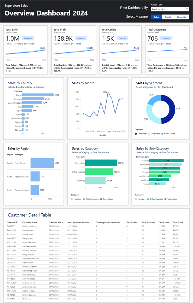
Create filter buttons (toggles) for easy interactivity
Align dashboard items using the background grid
Automatic filtering actions across visualisations (similar to Power BI), although these only apply to metrics when defined
Pre-formatted charts and tooltips
Create metrics with AI-driven insights and time comparisons.
Easy-build Data Tables (although no way to customise using any visual elements e.g. colours)
Ease of Use
Tableau Next feels very similar to Power BI in its usability - creating basic visualisations and insights is a quick process, requiring minimal setup. Like the coffee machine analogy of comparing Power BI to Tableau (Where Power BI = pre-configured coffee machine that can make you a limited selection of nice coffees, and Tableau = a fancy barista machine where you need skill to make a nice coffee, but you can really customise your drink as you like!) - Tableau Next is limited in a lot of functionality if you want to really customise your visualisations, but is very easy to use to create basic visualisation and insights.
Limitations compared to Tableau Desktop
Formatting & Layout Limitations
No custom text formatting (e.g. mark labels, headers, axis etc.)
Can’t hide the axis
Limited chart selection - no maps!
No ability to create a dual axis
No way to measure container dimensions, making it difficult to create proportionate layouts
No built-in chart titles - if want to add a title you need to create a container and bring in your visualisation alongside a text box
Tooltips can’t be customised, and no way to bring in additional dimensions to add detail to tooltips
Container repositioning is difficult without empty dashboard space
Filtering using a date value feels weird - can't seem to set a list to filter by e.g. Year, rather you can only select the Current, Previous or Next year.
Missing Analytical Features
Changes in visualisations aren’t reflected in dashboards until saved
Limited quick table calculations options e.g. no % of Total, whilst Running Total is available
No way to add filters to context on individual charts that receive the filter from the dashboard layer. E.G. If filtering to Top 10 (at the visualisation level) whilst dashboard filters to the current year (filter not applied directly to the visualisation) - there is no way of adding the year filter to context for the visualisation, meaning the Top 10 won’t be relative to the filtered year
Doesn’t seem that you’re able to create parameters or use them within calculations whilst in the visualisation layer - this needs to be done in the semantic model layer
Bugs 🪲
Tableau Next currently feels unstable and buggy. Some features intermittently fail - for instance, calculated fields in text boxes may not work initially but later start functioning without any change. This inconsistent behaviour makes it hard to know if you’ve made an error or hit a bug.
Summary
Tableau Next introduces a simplified and faster BI experience, integrating Salesforce with Agentforce. As a BI tool, I’d say it’s ideal for users looking for quick and easy insights that don’t require much formatting or deeper technical analysis. However, it lacks many of Tableau Desktop’s customisation capabilities, and advanced analytical capabilities meaning it doesn’t yet feel suitable for users who wish to create more complex dashboards with advanced filtering, calculations and chart types. Additionally the current performance issues/bugginess make it frustrating to use.